DPI WEEK 6 - Recolouring Black and White

Felice Jolin
Week 6 (29/10/24)
Digital Photography and Imaging
Project
1 / Exercises
TABLE OF CONTENT
WEEK 6 - LECTURES (29/10/24)
Mr. Fauzi explained to us that there are several principles of design that designer must follow such as:
1. Emphasis
There should be something highlighted to have
attractive composition.

Fig. 1.1 Emphasis
2. Balance and Allignment
Simplicity but tidy is one of they key
facetor for a good design.
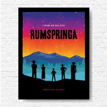
Fig. 1.2. Balance & Allignment
3. Contrast
Something that pops, idea out of the box that stick to
one memory. Background and element colour has significant difference.
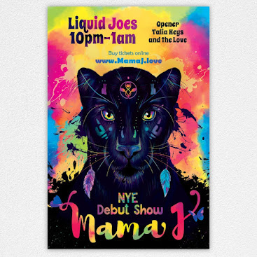
Fig. 1.3 Contrast
4. Repetition
Create a motive of repetition and strengthen your
design.
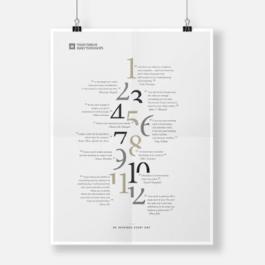
Fig. 1.4 Repetition
5. Proportion
Good composition of elements could describe how they
relate to each other.
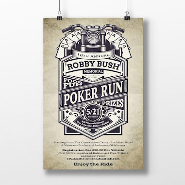
Fig. 1.5 Proportion
6. Movement
Movement to control elements in composition to led the
eye move from one to next information.
Fig. 1.6 Movement
7. White Space
Empty space around the composition for room to
breathe.
Fig. 1.7 White
Space
WEEK 6 - TUTORIAL
There are 2 exercises to do regarding colouring black and white picture. With the help of tutorial video, it ease the process of my work. Exericise 1 https://youtu.be/DeGpKh6pMfk, Exercise 2 https://youtu.be/Tye0ULqK9SQ
WEEK 6 - Practical
-
Exercise 1


First of, add layer and label it with the name, for instance, I want to colour the hair, I label the layer with 'hair' andsing brush to colour it with the colour I pick. The same step is applied to
-
Exercise 2
We are told to re-colour black and white picture by finding skin and hair colour online then applying it to the picture given. In this section we were taught to use 'select and mask' and refine edge judge tool to ease selection.
1. First Picture


Reference: left (hair colour), right (face colour)

The adjustment in Photoshop.png) 2. Second Picture
2. Second Picture


Reference: left (hair colour), right (face colour)
The adjustment in Photoshop
For the skin colour I adjust a bit of the hue/saturation so the colour is not too pale..png)
3. Third Picture


Reference : hair and face colour

The adjustment in Photoshop
.png)
4, Fourth Picture

Reference: left (skin colour), right (hair colour)
 The adjustment in Photoshop
.png)
5. Fifth Picture


.png)


.png)


.png)


.png)


Reference: left (skin colour), right (hair colour)

.png)
The video tutorial really helps me to do this exercise, for some part there is
the colour that does not really suit in so I put in adjustment like
hue/saturation but only a little amount. This exercise is quite challeging for
me because I need to stay focus to select parts especially for the hair, the
little details that may not be missed. This exercise trained me to stay focus
and do not rush while doing work.
.jpg)

Komentar
Posting Komentar