DPI - WEEK 9 - Poster Design Progress #2
 Felice Jolin
 Week 9 (19/11/24)
Digital Photography and Imaging
Project 2 / Exercises
TABLE OF CONTENT
WEEK 9 LECTURES (19/11/24)
Digital Realism VS Surrealism
Realism is as common as ordinary things in everyday world that we refer to as "reality."

Fig. 1.1 Realism
Surrealism is a tqist of realism. With its focus on dream imagery,
distort from the reality.

Fig. 1.2 Surrealism
Surrealism is a cultural movement that emphasizes the use of art to convey the artist's own ideas. Surrealism is one of the most popular digital art forms now. What is surrealism ? Dream-like scenes and symbolic images, unexpected, illogical juxtapositions.
There is no logic in surrealism, it is often characterized by unusual visuals and bizarre juxtapositions, which is inspired by dreams and the subconscious mind.
Fig. 1.3 Surrealism

Dadaism, an anti war art movement that is satirical and
nonsensical in nature.
Fig. 1.4 Dadaism

Salvador Dalí, a Spanish Surrealist painter and printmaker known
for exploring subconscious imagery.
Fig. 1.5 Salvador Dali's Art

How to make surrealism art?
- Sketch out roughtly your vision and key things.
- Fine image
reference that would help with your artwork.
- Convince yourself that
it coule be real while actually knowing it does not really exist.
-Approach
something challenging, with photoshop makes it easier to creat surrealism
image.
WEEK 9 Tutorial
- Mr. Fauzi posted tutorial of how to create loop animation. https://youtu.be/HQL5ntLlHTg
WEEK 9 Practical
- Mr.Fauzi check on our progress one by one and gave feedback during online class.
Digitise
1. I gather the photography I want to use from my
gallery.


2. I start to draw the key shaped door into the fairytale, inserted my quote,
the castle picture and myself. This was done in Adobe Illustrator.
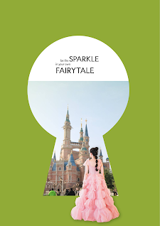


Fig. 1.10 Castle Edit #2
.png)
.png)


.png)
Komentar
Posting Komentar