Information Design / Exercises

Felice Jolin (0373636)
Information Design / Bachelor of Design (Hons) in Creative Media
Exercises
TABLE OF CONTENT
INSTRUCTIONS
Fig 1.1 Module Information Booklet
LECTURES
WEEK 1
Flip Topic 1 : Different Types of Infographics &
Online Tools
We were dived into groups of 8. We were assigned to research what is infographics, types of infographics as well as the examples.
WEEK 2
Flip Topic 2 : L.A.T.C.H
During online lesson, Mr.Martin assigned us in groups to search about what is L.A.T.C.H, the usage, each definitions and example of application.
WEEK 3
Flip Topic 3 : Chunking
During online class, Mr.Martin assigned us in group to earch about what is Chunking, the usage, and application in infographic, UI/UX, game, web and process.
WEEK 4
Flip Topic 4 : Manuel Limo's Nine Directives Manifesto
During online class, Mr.Martin assigned us in group
to earch about what is Manuel Limo's Nine Directives Manifesto. Explain each directives with
the example.
Fig 1.2 Presentation Slide
FLIP CLASS EXERCISE
WEEK 1
Poster Redesign
During the first meeting, after lecture, Mr.Martin assigned us to search online a bad infographic and redesign it using Canva. After searching in Pinterest, I found the poster below. The design in this poster feels empty, the information (text and graphic wise) seems not connected, as a result information is not clearly delivered. The overall design is not attractive as the title itself also didn't stand out.

Fig 1.3 Original Infographic (Week 1, 05/02/26)


.jpg)
.jpg)
Fig 1.5 First & Second Draft Infographic (Week 1, 05/02/26)
However so, I am not satisfied with the result, the second poster was quite hard to read and some of the red shades are quite similar to be compared. I decided to use another color than red and change the layout where I lay the perceptage in the centre. Now i feel the design is not too monotone, more approachable and information is presenter clearer.

Fig 1.6 Final Infographic (Week 1, 05/02/26)
WEEK 2
Kinetic Typography
This week, we had tutorial of kinetic typography in class. Mr.Martin shhowed us example during class while we follow. The exercise uses the song 'So What' by P!nk. The lyrics used is as below:
"So, so what, I'm still a rockstar"
To begin, I import the mp3 into After Effect. Then I type each text with different layer. Next, we need to add null object and connect all the layer to it so all the text can move simultaneously. When press the 3D icon, we could also change it position based on X, Y or Z axis.


Fig 1.7 Kinetic Typography Tutorial (Week 2, 11/02/26)
Fig 1.7 Kinetic Typography Tutorial (Week 2, 11/02/26)
TASK
Exercise 1 : Quantify & Visualize Data
WEEK 1
In the first task, we were assigned to quantify chosen items, arrange and present it in a layout. I decided to use leaves.
First, I walk around Taylor's to find different types of leaf. They I collect it and store it inside a book.

.jpeg)

After collecting 6 different leaves, I gatehr them all. Below is the data collected.
.jpeg)
Fig 1.7 Data Collected (Week 1, 06/02/26)
Next, I sorted it based on the type of the leaf shape, then I arrange it classifying with the margin that the leaf has.

Fig 1.8 Sorting Data (Week 1, 06/02/26)
After arranging, I did some sketches for the layout. I used my notebook and black pen to draw out some ideas. As there were some shape of leaves that has same margin, I then decided to broadly classify them info 3 margins and each has different shape of leaves.
.jpeg)


Fig 1.10 Layout #1 (Week 1, 06/02/26)

Fig 1.11 Layout #2 (Week 1, 06/02/26)
.jpg)
Fig 1.12 Progress (Week 1, 06/02/26)
.png)
In the final outcome, there are 40 leaves in total. Divided into 3 groups according to their margin with Dentate consist of rhomboid(8), Serrate consist of lobed(6) and ovate(10) while Entire consist of lanceolate(7), cordate(4) and elliptic(5).
Exercise 2 : L.A.T.C.H
WEEK 2
Durign week 2, we were assigned to make a poster that combine utilize at least 4 of L.A.T.C.H. principles. This principle stands for:
L - Location
A - Alphabet
T - Time
C -
Category
H - Hierarchy
For the subject content of the poster, Mr.Martin provide us with the sources below or we can use any other source.
Pokedex: https://pokemondb.net/pokedex/ FFXIV
Bestiary:
https://ffxiv.gamerescape.com/wiki/Category:Bestiary
Dinosaurs:
https://www.mainstreetsmiles.com/fun-stuff/teeth-25-dinosaurs-prehistoric-creatures/
After viewing all the sources, I decided to use Pokemon. We were allowed to re-use the images of the Pokemon character however we should design the background our own for the poster.
Before I begin to design the poster, I did some research for the pokedex and decided to select Brilliant Diamond & Shining Pearl Pokédex of the 8th generation which located in Sinnoh region.
Location
As mentioned the location is in Sinnoh region for the pokemons.
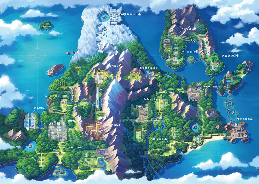
Fig 2.1 Location (Week 2, 09/02/26)
Category, Time & Hierarchy
For the poster, I will categorize the pokemon into grass, water, fire and fairy types.
For the timeline, it will be represented by arrow of the base form into the final evolution to indicate which pokemon comes first.
For the hierarchy, it will be represented by presenting the pokemon of the base feature to the strongest version of the pokemon.


Fig 2.2 Pokemon (Week 2, 09/02/26)
After gathering the information, I start to sketch some layouts. Below I have 3 sketches. The first and second apply landscape proportion and with the map at the centre accompanied by the 4 categories of pokemon. While the third sketch is more to comparison of water and fire type with each pokemon evolution.

Fig 2.3 Sketch #1 & #2 (Week 2, 12/02/26)

Fig 2.4 Sketch #3 (Week 2, 12/02/26)
I decided to chose the first sketch. On bottom left, I will apply pokemon ball as if the map comes out from it.

I proceed to illustrator. I collect the pokemon from the given website
and continue the design. Then I also draw the four icon which is part of
the
category (fire, water, grass, and fairy). All illustration were
drawn using pen tool.

Fig 2.5 Gathering Pokemon (Week 2, 12/02/26)

Fig 2.6 Pokemon Ball (Week 2, 12/02/26)
Then I start to draw the map. As there are 4 types of pokemon (water, grass, fire, and fairy), I would like to make 4 main location for them. Lake for the water type, lava for the fire type, mountain for fairy type and ground for the grass type.

Fig 2.7 Map (Week 2, 12/02/26)


Fig 2.8 Progress (Week 2, 12/02/26)


Fig 2.9 Progress (Week 2, 13/02/26)
Lastly, I add the information box and do final adjustment as below.

Fig 2.10 Final Infographic (Week 2, 15/02/26)
Location: Sinnoh Region
Time: Shows changes of pokemon over time (evolution)
Category: Different types of pokemon (water, fire, grass and fairy)
Hierarchy: Dihherent strenght of each pokemon from weakest to strongest (HP)

FEEDBACK
Week 1
Mr.Martin suggested us to not buy the items
for Exercise 1, instead we can just use objects around us. I propose
leaf to be the subject of my data and Mr.Martin approves.
Week 2
Mr.Martin reminded us to layout the progress
of Exercise 1 from sorting, arranging and finalized ones. For the
Exercise 2, I showed Mr.Martin my sketches, he mentioned it is better to
visualy draw the map rather than just plaching a text of the
location.
Week 3
We should finalize exercise 2 and start to work on
to animate chart.
REFLECTION
Experience
I had a nice experice throughout this 2 weeks.
On the first week, while doing Exercise 1 I took leaf as the subject.
Hence, I got to explore outdoor and collect different kinds of leave, I
was also able to play around witht he layout when quantifying the data.
While during Exercise 2, I was a bit blur since I seldom play games. I
decided to use Pokemon for the poster however I didn't play that much
too. So I spend quite some time to do the research.
Observation
In Exercise 2, anything can be used as long as
it has quite amount of quantity. While for my case, I've also observed
that the leaves has many characteristics to be classified and
categories, however to simplify, I chose based on the shape and margin
only for the quantify data. For Exercsie 2, I've also observed from
examples given by Mr.Martin that chunking is often used. Threfore, i
used that method for my poster to separate the pokemon
categories.
Findings
Although Exercise 1 might look easy, it actualy
took me not so fast to collect, srt, arrange and finaly compose a good
layout for the data. While for Exercise 2, I've found that information
can be grouped as category, and not too much information will ease the
key message to be delivered especially I've used the L.A.T.C.H.
principles.
.jpg)

Komentar
Posting Komentar