.jpg)
Week 9 - Week 13 (17/06/25 - 15/07/25)
Felice Jolin (0373636)
Advanced
Typography / Bachelor of Design (Hons) in Creative Media
Task 3 Type
Exploration and Application
TABLE OF CONTENT
Lectures
Instructions
Task 3 - Type Exploration and Application
Final Outcome Task 3
Feedback
Reflection
Further Reading
LECTURES
Click here to see previous lectures
back to top
INSTRUCTIONS
<iframe
src="https://drive.google.com/file/d/11f7j8AC-7IyeFz7rVyGAtKWFraS5cPrA/preview"
width="640" height="480" allow="autoplay"></iframe>
Module Information Booklet
back to top
TASK 3 - TYPE EXPLORATION AND APPLICATION
Proposal
We were assigned to create a font based on one of three given
directions:
- Designing a typeface that contributes to solve a broader issue
- Exploring existing letterforms within a specific field of interest
- Creating an experimental typographic design
Fig 1.1 Proposal presentation (Week 8, 10/06/25)
After presenting on week 9, I decided to chose the first idea, to continue the
letterforms I've made on Typography Task 3 back in semester 1.
Fig 1.2 Typography Task 3 Font (Week 8, 10/06/25)
Sketches
Below is the initial sketch from previous Typography Semester 1 Task 3.
Instead of using curved edges, Mr.Vinod suggested me to make it into straight
edges.

Fig 1.3 Typography Task 3 Font (Week 8, 10/06/25)
I tried the straight edges for some letters. I feel that it looks more tidy
and clean. Mr.Vinod also agree to proceed with the straight edges.
Fig 1.4 Typography Task 3 Font modification (Week 8, 10/06/25)
Moving on, I did the sketch for the new letterform version. Below are the
alphabets in upper and lowercase with different variations for some letters.
Fig 1.5 New sketch (Week 8, 10/06/25)
Digitisation
Uppercase
I began doing work in Illustrator with artboard width 1500px and 500px
x-height.
Fig 1.6 Curve shape development (Week 9, 17/06/25)
I enable grid to ease my work. First, I need to make the key curved shape. I
used circles and measure the width to be the same as the straigh lines. Then
using shape builder to get the curve shape. Here I already get the basic
shape to be applied for the letters.
Fig 1.7 Uppercase process (Week 9, 17/06/25)
A and B was a smooth work. Moving on to C it was quite challenging as using
the basic curve shape doesn't fit the grid. I tried to modify it but still
mantain the similar width as the original curve. After getting the structure
for C, I could apply it for D and E.
I've got 2 options for F, however I rather feel the right side one is not
clear and firm, I decided to go witht he left one.
For letter G, I have some variations. For vaariant #1 and #2, the strokes were
produced from cutting part of the curved shape. While variant #3 use the letter
C. I decided to go with variant #3 as it looks simple yet impactful.
As for letter I and T the top stroke were taken from the curve shape, however
cut the ecess below to ensure fit in grid above x-height.
Moving on to letter J, most of the variant feels so weird and odd to me, I
tried several ways and decided to go with design #2 with a more clean and
modern look.
I continue the other letters, letter M is the same as N just double the width.
While K, L, O, P, Q, R, and S occupies the original curve
shape.
Designing letter U, I used the curve shape as the base and modified it from
there to minimize it fiting the grid.
Letter V and W is the same just that W is double the width of V, the basic
shape here were using the curved stroke and extend the straight part.
The letter Q development, for the finishing, I made a gap by using half the
stroke size.
For letters X, Y, and Z, I utilize the basic curve shape and alter the angle
to form the letters. The top part of X and Y is smae as the one I use to
develop letter V ad W.
Fig 1.8 Uppercase draft #1 (Week 9, 17/06/25)
Lowercase
I made 2 choice for lowercase with difference x-height. However the width I
maintain it from the uppercase. The curve stroke was taken from the
uppercase.
Fig 1.9 Lowercase progress (Week 9, 17/06/25)
Above is with 500px x-height while below is 600px x-heigth.
Fig 1.10 Lowercase draft #1 (Week 9, 17/06/25)
Punctuations
Fig 1.11 Punctuation process (Week 9, 17/06/25)
Fig 1.12 Punctuation draft #1 (Week 9, 17/06/25)
I start with the period. I cut the part from the curve stroke to get
this. Afterward, I designt the coma.
Moving on I desgin the round and square bracket. The round bracket was
developed from base structure of letter U. For the square bracket, it was
using straight stroke with the basic curve stroke.
The question mark horizontal stroke was token from letter Z however the top
stroke was made curve. The hastag was developed from the basec curves and
stright strokes.
Numbers
For numbers I maintain the height and width like Uppercase. For number 3 and 8
I explore with 2 different variants.
Fig 1.13 Numbers draft #1 (Week 10, 24/06/25)
Week 11 on class, Mr.Vinod reminded us that artboard size should be 1000px so
later on the is a good amount of space when the letters are typed into
paragraph. I just remember that my artboard size is 15000px. I needed to
repeat the entire thing. Mr.Vinod also mentioned that m punctuation size looks
weird. I need to make reference an existing font when designing.
Second Attempt
Uppercase
First, I resize the artboard into 1000px. Then I copy the draft #1
Uppercase and make the overall size smaller. I make sure there is plenty space
above and below for ascender and descender.
Fig 2.1 Uppercase process (Week 11, 01/07/25)
Fig 2.2 Uppercase (Week 11, 01/07/25)
Lowercase
The lowercase from draft #1 is as below. The sizing looks quite weird, the
lowercase seems to be quite short and not proportional.
Fig 2.3 Lowercase draft #1 testing (Week 11, 01/07/25)
I decided to change the x-height. With this, I got new size of x-height of
431,9168 px. for the curved stroke, I made new one with the new x-height.
The width is the same as uppercase.
Fig 2.4 Curve shape process (Week 11, 01/07/25)
In addition, I also use Franklin Gothic Heavy font as the size
reference.
Fig 2.5Lowercase process (Week 11, 01/07/25)
Fig 2.6 Lowercase (Week 11, 01/07/25)
Numbers
For numbers I also used reference from Myriad Pro font.
The size were all same height and width as cap height.
Fig 2.7 Numbers process (Week 11, 01/07/25)
Fig 2.8 Numbers (Week 11, 01/07/25)
Punctuation
Fig 2.9 Punctuation progress (Week 11, 03/07/25)
I start with period. I used the square from letter i and enlarge the size a
little. Moving on, the coma was designed based on 2 period height. For
asterisk, I developed it from letter x, rotate and shape builder.
.png)
Fig 2.10 Punctuation progress (Week 11, 03/07/25)
The question mark was modified from number 7. While rounded bracket are
developed from letter c. Square bracket is using straight stroke plus the
sliced curved shape from the uppercase. Quatation mark is from the coma. I
was struggling the most working on and symbol. I used number 8 as the base
and alter from there.
Fig 2.12 Punctuation (Week 11, 03/07/25)
FINAL FONT DESIGN
Fig 2.13 Font outline (Week 11, 04/07/25)
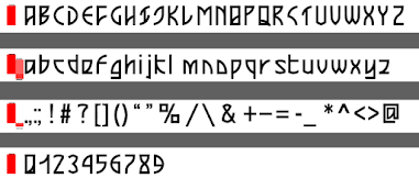
Fig 2.14 Font Final (Week 11, 04/07/25)
Font Forge
I used Fontforge to import my letterform and do the kerning. First of all,
I used asset export in Illustrator, export it in a svg formart.
Fig 3.1 Asset Export (Week 11, 04/07/25)
Afterward, I export one by one into FontForge. Some of them were not sitting
on the baseline, I need to move it.
Fig 3.2 Import files on FontForge (Week 11,
04/07/25)
Fig 3.3 Imported files on FontForge (Week 11,
04/07/25)
Kerning
After importing and tidying up all the letters, I began kerning. I began by
folowing the rules below given by Mr.Vinod. However, there were slight changes
made during the progress expecially for letter f, g, s and t for both upper
and lowercase because the letters were not straight for the left and right
part. So adjusment were needed there.
Fig 3.4 Kerning rules (Week 11, 05/07/25)
Fig 3.5 Uppercase kerning (Week 11, 05/07/25)
Fig 3.6 Lowercase kerning (Week 11, 05/07/25)
Fig 3.7 Punctuation kerning (Week 11, 05/07/25)
Fig 3.8 Number kerning (Week 11,
05/07/25)
Moving on, I generate the font and download it to be used for font
presentation and application.
Fig 3.8 Install font (Week 11, 05/07/25)
Font Presentation
Before designing the font presentation, I look up for color palette in Adobe
Color.
Fig 4.1 Uppercase kerning (Week 11, 05/07/25)
I aim to have galaxy theme and inspired by wave and aurora lights. I began to
design the background first. I did in Illustrator, using brush and liquify
effect.
Fig 4.2 Background edit (Week 11, 05/07/25)
Fig 4.3 Background edit (Week 11, 05/07/25)
I made some other design for variations.
Fig 4.4 Background edit (Week 11, 05/07/25)
Draft #1
Below is the first draft for the font presentation.
Fig 4.5 Background edit (Week 11, 05/07/25)
Looking at it, feels something like missing about the galaxy. I decided to
add the stars texture on the background in photoshop.
Fig 4.6 Background edit (Week 11, 06/07/25)
Fig 4.7 Background edit (Week 11, 06/07/25)
Mr.Vinod commented on the first draft, it's good to have small and big size of
text, however, I should enlarge some of them that looks very tiny as I should
highlight my font.
Draft #2
Before on draft #1, I used all my own font. However, now I blend with Arial
font for some text. I enlarge the tiny text and did some more explorations for
the design. For some of the headings I use the effect outer glow to highligh
and enhance spark
Fig 4.8 Exploration (Week 12, 08/07/25)
FINAL FONT PRESENTATION
Fig 4.9 Font presentation 1 (Week 12, 08/07/25)
Fig 4.10 Font presentation 2 (Week 12, 08/07/25)
Fig 4.11 Font presentation 3 (Week 12,
08/07/25)
Fig 4.12 Font presentation 4 (Week 12,
08/07/25)
Fig 4.13 Font presentation 5 (Week 12, 08/07/25)
Font Application
I start by searching the internet for suitable mockup. I got mine from
freemockup.com. I wanted to make
the concept of exhibition, so I search for poster/signage/frame/billboard
mockup and tickets.
The background of the poster was made in photoshop using brush, blur effect
and texture.
Fig 5.1 Bacground edit Photoshop (Week 12,
12/07/25)
I tried several layouts to find the best outcome. I found using small elements
and thin storkes were not compatible when placed in the poster mockup.
Therefore, I decided to remove it. I decide to go with the second design
(middle ones).
Fig 5.2 Bacground edit Photoshop (Week 12,
12/07/25)
Before designing the ticket, I also looked for inspiration from pinterest.
Fig 5.3 Mockup ticket reference (Week 12,
12/07/25)
Fig 5.4 Ticket design (Week 12, 12/07/25)
I began by working on the design for the mockup in Illustrator and later
export to Photoshop to edit.
Fig 5.5 Signage mockup (Week 12, 12/07/25)
Fig 5.6 Ticket mockup (Week 12, 12/07/25)
The background gradient for the ticket is using from the previous background
as font presentation to maintain consistency.
Font Application - Honor Competition
Standby includes clock template design and personalized signature template
designs.
We were to required to design the following:
1. Clock design
2. Personalized Signature Design
3. Overall Visual design
4. Animation Design
I start by working on the design in photoshop. To make things bold and
minimalist I decided to just use black white and red from my previous color
palette. Below is the progress of designing the clock template. I mainly
used gradient tool for the design. For the phone screen, I tried using bright
color but it doesn't suit well, so I go with the dark color.
Fig 5.7 Standby design (Week 12, 12/07/25)
I made more variations here for the overall visual design, some were using
additional strokes elements, however, I ended up prefer the first
design.
Fig 5.8 Overall Visual design
(Week 12, 12/07/25)
Clock Animation
As I have done with the clock design, I export it to After Effect to edit the
animation. Before that I separate each elements into different layer in
Illustrator to ease edit in After Effect. Below is the animation
process.

Fig 5.9 Animation (Week 12, 12/07/25)
Unfortunately, I'm not able to submit the Honor Compeition as the category
submission for Standby is no longer available.
Fig 5.10 Honor Submission (Week 13, 14/07/25)
FINAL FONT APPLICATION & HONOR COMPETITION
Fig 6.1 Signage mockup (Week 12, 12/07/25)
Fig 6.2 Ticket mockup (Week 12, 12/07/25)
Fig 6.3 Clock design (Week 12, 12/07/25)
Fig 6.4 Personalized Signature Design (Week 12, 12/07/25)
Fig 6.5 Overall Visual Design (Week 12, 12/07/25)
Fig 6.6 Animation (Week 12, 12/07/25)
FINAL OUTCOME TASK 3
Click here to download font
Fig 7.1 Xelora Font (Week 13, 14/07/25)
Fig 7.1 Xelora font (Week 13, 14/07/25)
Fig 7.2 Xelora font uppercase (Week 13, 14/07/25)
Fig 7.3 Xelora font lowercase(Week 13, 14/07/25)
Fig 7.4 Xelora font punctuation (Week 13, 14/07/25)
Fig 7.5 Xelora font number (Week 13, 14/07/25)
Fig 7.6 Font presentation 1 (Week 13, 14/07/25)
Fig 7.7 Font presentation 2 (Week 13, 14/07/25)
Fig 7.8 Font presentation 3 (Week 13, 14/07/25)
Fig 7.9 Font presentation 4 (Week 13, 14/07/25)
Fig 7.10 Font presentation 5 (Week 13, 14/07/25)
Fig 7.11 Signage mockup (Week 13, 14/07/25)
Fig 7.12 Ticket mockup (Week 13, 14/07/25)
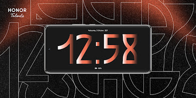
Fig 7.13 Clcok design (Week 13, 14/07/25)
Fig 7.14 Personalized signature design (Week 13, 14/07/25)
Fig 7.15 Overall visual design (Week 13, 14/07/25)
Fig 7.16 Animation (Week 13, 14/07/25)
Fig 7.17 Font presentation PDF (Week 13, 14/07/25)
Fig 7.18 Font Application (Week 13, 14/07/25)
Fig 7.19 Font Application (Week 13, 14/07/25)
Fig 7.20 Animation (Week 13, 14/07/25)
back to top
FEEDBACK
Week 9
General Feedback: Mr.Vinod gave feedback
for task 3 proposal.
Specific Feedback : Mr.Vinod said
the first idea is interesting (expansion of Typography Task3),he said to
not use the second idea (Advanced Typographjy Task 1 Type & Play)
while the thirdidea (Tai Er) has been used multiple times by
provious students. He suggested me to go withidea 1 and decide I would
applicate it to what (e.g. sci-fi, music, tech)
Week 10
General Feedback: Mr.Vinod gave feedback for
uppercase.
Specific Feedback: Looks good, you can continue
with lowercase.
Week 11
General Feedback: Mr.Vinod gave feedback for
lowercase and punctuation.
Specific Feedback: You should use
artboard height 1000px. The punctuation size looks weird. When designing a
font, use existing font as a reference of height and size, do not
assume.
Week 12
General Feedback: Mr.Vinod gave feedback for our font
presentation.
Specific Feedback: Mr.Vinod said I can go on
with what I have in the font presentation and reminded me to not make the
fonts too small.
Week 13
General Feedback : Mr. Vinod gave
feedback for overall Task 3
Specific Feedback :
Good.
back to top
REFLECTION
Experience
Week 9 to 13 feels so fast, there were a lot to do,
from designing the typeface until the presentation and application. It was a
challenging yet interesting work to do and explore. As my font needs accuracy
and consistency, it took me time to finalize the font, I repetitively check
whether they are good already. Despite the limited time, I am grateful to able
to finish task 3 on time.
Observation
During class, I am able to view other peers
work, I could see different styles and I realize that consistency of key
characteristics in every letter is important to see the letters as a family.
I've observed that font presentation doesn't need to be too complicated, I
should be simple yet showcasing the font properly.
Findings
Do not underestimate fonts that looks simple, because
doesn't meant it is easy to design as accuracy and consistency is the key.
When designing a font, one need to know the purpose and theme for the it. With
that, it could be guide to do the next step, designing the font itself, make a
presentation and applicate it into mocups.
back to top
FURTHER READING
Fig 8.1 The Vignelli Canon by Massimo Vignelli (Week 9,
17/06/25)
I read the book Vignelli Cannon on Design by Massimo Vigneli. In this book, I
am interested to read about the white space.
The printed page's white space is the architectural equivalent of space. The
context is qualified by space in both cases. White space is crucial to clearly
define the hierarchy of each component.
White space do not just seperate different parts of conttent, but also
help placing the message inside the page's context.Tights margin makes
tension between text images and edges of of the page. Wider margin reduce
tension.
Iincreasing or decreasing the letter spacing (kearning) gives the words
a unique expression and character. This entire process involves
manipulating space and used in layouts to get desired expression.
One of the most important aspects of a composition is the interaction between
the size of the type and the space around it.
back to top


.png)
.png)


.png)


.png)
.png)


.png)


.png)


Komentar
Posting Komentar