Advanced Typography / Task 2 Key Artwork and Collateral
.jpg)

Week 4 - Week 6 (13/04/25 - 27/05/25)
Felice Jolin (0373636)
Advanced
Typography / Bachelor of Design (Hons) in Creative Media
Task 2 Key
Artwork and Collateral
TABLE OF CONTENT
Task 2 / Part A - Key Artwork
Task 2 / Part B - Collateral
LECTURES
Lecture 04 : Designing Type
Two reasons for desinging a type face by Xavier Dupre:
- - Type design carries a social responsibility, when a designer sees there's a prblem to be solved suahc as improving its legibility.
- - Type design is a form of artistic expresion
Typeface by Adrian Frutiger

-
He valued contribution to typography includes the typeface Univers
and Frutiger
- Frutiger is a san serif typeface design in 1968.
- Frutiger is specificaly made for newly built Charles de Gaulle International Airport in France.
- Goal of this Frutiger is clean, distinctive, functional legible typeface that is easy to see from both close upa nd far away.
- Considerations : letterforms to be recognise even in poor lightning condition or reader was moving quickly past a sign.
Type design by Matthew Carter

Fig 1.2 Verdena (Week 4, 13/05/25)
- Carter's fonts were created to address specific challenges technical, purpose is to still be legible even at a very small size on the screen due to raising populaity of the internet & electronic devices.
- Considerations/limitations : Vedana font has characteristics from pixel, not pen or brush so commonly caused confussion on lower chase character of i, j, l.
- Verdena is today adapted by IKEA company.
- Matthew Carter is also well known for Georgia.

Fig 1.3 Bell Centennial (Week 4, 13/05/25)
- Bell Centennial typeface porpose is used for telepone directories.
- It is improvement of Bell Gothic.
- Bell Centennial has ink traps that will be covered by the ink after the fast printing.
- Reasons of improving this typeface is because telephone number in telephone directory is printed in a very rough with fast printing caused blurriness, instead of sharp, you get round ages, therefore ink traps is introduced in Bell Centennial
Type design by Edward Johnson

Fig 1.4 Johnston Sans (Week 4, 13/05/25)
- He is a creator of 'Johnston Sans', a hugely influential underground typeface in London. It is for London's underground railway poster and signage.
- It was bold with simplicity, combination f classical Roman proportion and humanist warmth.
- Considerations/limitations : Apply proportions of Roman capital to the typeface, rooted in historty of traditional calligraphy but is elegant and simple.

Fig 1.5 Gill Sans (Week 4, 13/05/25)
- Gill sans was based on Johnston's work with some minor differences.
General Process of Type Design
1. Research
- Understand the type history (context & perspective), anatomy (understand different part of a letter) and conventions (understand the unwritten tool of typography).
- Know terminologies such as side bearing, metrics and hinting
- Determine type's purpose - what it will be used for, what applications it is used in. For example schoolbus/airport siganages.
- Examine existing font for inspiration/ideas/contect/reference/usage patterns
2. Sketching
- Some designers are more confident with their hand and uses traditional tools such as brush/pen, ink and paper as they have a better control fot it, then scan for digitization.
- Some sketch using digital tools like Wacom, directly in a font design software. Quicker , consistent but impede natural movement of handstokes
- Sketching manual is slow, has more deliberation but cost more time.
3. Digitization
- Software for digitization are Fontlab and Glyphs.
- Radability of the typefaces is dependent on it.
4. Testing
- Part of process of refining and correcting typeface
- Prototyping is part of testing process
- Designing typeface is another thing from considering typeface is working by testing
- Readability and legibility is more imporant in text type rather display type as it is more expresive.
5. Deploy
- There will always be teethign problems that didn't come when testing and prototyping stage.
- Testing is important so that isue is minor.
Typeface Construction
Roman Capital uses grid consist of square, inside is a circle that touces the lines of the square in four places. Within the square there is rectangle that is 3/4 the size of the square that is placed in the centre of the suqare. Creating grid as a base could help in creation of letterforms.

Fig 1.6 Roman Capital (Week 4, 13/05/25)
Construction and considerations
- Depending on the form, 26 alphabets can be arranged in a ground.
- Group of capital and group of lowercase
- Categorized by shape into round, rectangular, round-rectagular, diagonal and diagonal-rectangular.
.png)
Fig 1.7 Grouping (Week 4, 13/05/25)
- Consider extrusion of curved for past the baseline or cap line.
- Vertical allignment ebtween curved and straight form.
- Visual correction for distance between letter.
- Having a uniform visual whitespace ; letters between letters should be the same "fitting".
.png)
Fig 1.5 Space and allignment (Week 4, 13/05/25)
- When designing tyypefaces it is important to understand that there is intrinsic and extrinsic motivation.
- Intrinsic: a designer is driven to design a ttypeface by interest, the from come close to fulfill the desire. Or designer identifies a problem that he/she can solve through design typeface.
- Extrinsic : Designer has been commissioned / student-designer has a task to be completed.
- To have a succesful design, designer need to be invested in the idea and understand the requirement/limitations/use/stakeholder
Lecture 05 : Perception & Organisation
Perception
The way something is regarded, understood or interpreted. What you see and understand.
Perception in typography is about visual navigation and interpretation of reader visa contrast, form and organisation of content. Contrast can be textual, visual, graphical or in the form of colour. Contrast is to create distinction or differentiation of information.

2. Weight
4. Structure
5. Texture
6. Colour
7. Direction

Fig 1.7 Carl Dair's Seven Typographical Contrast (Week 5, 21/05/25)

Fig 1.7 Contrast in size (Week 5, 21/05/25)
- Points to which reader's attention is drawn. A bigger letter will be seen first before the small letter. Common use of size is making the heading bigger than content.

- How bold type can stand out within lighter type of same style.
- Using bold, rules, spot, square also provide heay area and powerful point for emphasis.

- Distinction of capital and lowercase letter.
- Roman letter and italic variant.
- Condensed and expanded version of typeface.
Structure

- Differet letterform pf different kind of typeface.
- Monoline sans serif and a traditional serif
- Italic and blackletter
Texture

- By putting together the contrast of size, weight, form and structure and apply in a block of text on a page comes into contrast of texture
Direction

- The opposition between vertical and horizontal text and the angle sin between
- Mixing wide lock of text with tall column of short lines.
Colour

- The use of colour is suggested that second colour is often less emphatic than plain black and white.
- It is important to select where to introduce the colour, in the headline or in a particular pieces of information in within the large amount of text.
Form

In Greek, typos means form and graphis meand writin. Typography has 2
functions :
1. Represent a concept
2. To do so in a visual form.

Fig 1.15 Form (Week 5, 21/05/25)
Gestalt
Gestalt means put together in German.
Gestalt emphasize that the whole
of anything is greater than its part
We experience things as a unified
form instead of breaking into the smallest element.
Perceptual Organisation / Groupings :
1.Law of Similarity
2.
Law of Proximity
3. Law of Closure
4. Law of Continuation
5.
Law of Symmetry
6. Law of Simplicity

Fig 1.16 Gestalt (Week 5, 21/05/25)
Law of Similarity
Elements that are similar to each other often
perceived as unified group. Similar can be in colour, orientation, size or
motion.
Law of Proximity
Items close to each other tend to be group
together and vice versa.
Law of Closure
Tendecy to see completed form even when picture
is incomplete.
Law of Continuation
Human tend to see objects as different,
singular, uninterrupted object even when it intersect.
INSTRUCTIONS
Module Information Booklet
<iframe
src="https://drive.google.com/file/d/11f7j8AC-7IyeFz7rVyGAtKWFraS5cPrA/preview"
width="640" height="480" allow="autoplay"></iframe>
TASK 2 / PART A - KEY ARTWORK
Mind Mapping
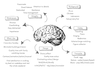(19).png)
Fig 2.1 Mind Map (Week 4, 14/05/25)
First of all, we were instructed to make a mindmap about ourself.

Fig 2.2 Sketches (Week 4, 15/05/25)

Fig 2.3 Digitize (Week 4, 16/05/25)
When digitizing, I come up with more variants and the explanation beside. During the feedback session, Mr.Vinod asked which one gravitize to me the most and I chose the 4th row of the first column.
Mr.Vinod say the letter 'N' needs improvement as it looks like 'H'. The overall wordmak is imbalance, it begins big but ends small and looks like want to collapse

Fig 2.4 Refining Process (Week 5, 20/05/25)
Above is the process of refining the wordmark. I use oval as suggested by Mr.Vinod to maintain overall balance. Chosen keyword : playful, fun, bold and rounded. The idea was to look playful, but at the same time I see a puzzle-like feature. This could represent that elements completed each other.

Fig 2.5 Further Refinement Process (Week 5, 20/05/25)
I further refine my wordmark, making sure that the space are
consistent and overall tidyness.

Fig 2.6 Final digitized key artwork (Week 6, 27/05/25)

Fig 2.7 Week 6 on class submission (Week 6, 27/05/25)
During week 6, we applied the wordmark into t-shirt as instructed from Mr.Vinod.
Colour Application

Fig 2.7 Colour testing (Week 6, 27/05/25)

Fig 2.7 Colour Palette (Week 6, 27/05/25)

TASK 2A FINAL OUTCOME


TASK 2/ PART B - COLLATERAL
We were assigned to expand our key artworks identity into 3 (items) collateral. Later on make an instagram account and design feed consist of 9 posts. Take a black and white portrait and place key artwork artistically. Laslty, animate the key artwork. Before starting, I look for references from Pentagram and Pinterest.
Reference

Fig 3.1 References (Week 6, 27/05/25)
Colour
The chosen colour palette from task 2A.

Fig 3.2 Color palette (Week 6, 27/05/25)
Wordmark
Below is the variations of color that I will use for my ig feed.

Fig 3.3 Color (Week 6, 27/05/25)
Pattern
First, I start with pattern expansion. Some were using the whole wordmark, some were modified using clipping mask with the logo repeated twice in an opposite manner. By making these options also ease me to apply it in my mock-ups. I would like to have a neat yet playful deisgn. Therefore for some design, the cut of the wordmark is within a rectangular shape.


Mascot
In addition to that, I created a mascot that suits my brand. The mascot has a rounded shape with cheerful expression, and the shapes were taken and modified from the letter O of the wordmark itself. Therefore it still portrays playfulness and fun. It is visually allign with the brand ,with smily face that that suggest approachable charactrays playfulness and fun. It is visually allign with the brand ,with smily fater.

Mock-Up
Moving on, I continue with the mock-ups. Most of my mock-ups were taken from here. As my brand has a fun/fresh/playful identity, I tried to go allign with the trending stuffs and chose bucket hat, cropped oversized t-shirt and a tote bag.
For the cropped oversized t-shirt and a tote bag, it was made using Photoshop while the bucket hat mock-up was edited in Illustrator. I first made the design in Illustrator and place link into photoshop for the design of the mock-ups.
.jpg)
Fig 3.7 Collateral (Week 7, 03/06/25)
After I made the collateral I move it into Illustrator to give background colour.

Bucket Hat
I chose bucket hat as it go allign with my branding which is playful. This hat looks stylist and with the minal design of having the wordmark in the middle would highlight it's identity. In addition, I add the mini logo on the left side.

T-Shirt
Below is the initial design with the wordmark in the buttom centre and the small logo on the right sleeve. However, I feel to make other design for one t shirt.

For the blue t-shirt, I decided to place the wordmark in a small size on top left while on the sleve I add the logo which I created previously.

Tote Bag
For the design of totebag, initially I'm using the repetition of my wordmark with the small logo on the side. However, Mr.Vinod said that it looks too decorative and repetitive.

Therefore, I changed the design with just the logo in the centre and the wordmark below. I feel that it looks better with clean design. I proceed with this one.

Self-Portrait
Next, I proceed to do the black and white self-portrait. For this I already have a clear direction what I want it to look like. I would manipulate as my head represent 'o' letter and here is the result with the help of masking layer.
.jpg)
Fig 3.14 Self portrait (Week 7, 03/06/25)

Fig 3.15 Self portrait (Week 7, 03/06/25)
Instagram Feed
Moving on, I start to design the Instagram feed. I was quite struggling here to decide what only to put in the 9 post, the composition, arrangement and what to put. This part too me the most time to arrange and deisng. I tried several colour placements and designs.

This was my first trial for the colour in the feed, however I'm not satisfied witht the arrangement and tried more variations.
First Draft
I made this tiles before designning the pattern. Mr.Vinod said that there is not much exploration of pattern. Therefore, I design other variants.

Fig 3.17 Feed Trial (Week 6, 03/06/25)
Second & Third Draft
Up to here I'm still not satisfied with the result, Mr.Vinod also agree that not much exploration of pattern. Therefore I tried to improve more tile by tile.

Development per tile
#1
I would like to make this tile having a pettern so I used the one I have made previously which is 1 and 2. However, I didn't really like the design and composition. I tried to make other layout and adding relevant keywords. Design 3, I have pattern in the background and I feel it's too loud, therefore, I discard it and play around witht the letter and other elements such as the letter O from my wordmark as a bubble in design 4.


#2
Moving on to the next tile, the design on the tote bag was suggested by Mr.Vinod to just apply my logo in the centre and wordmark onthe buttom right. Doing as suggested, I feel that it is better and moving on with design 2. In addition, as for the tile that has mockup, I made a signature post by placing the mascot on top left.

#3
For the bucket hat tile, I didn't change much from the first design, I just adjust the size and create new layout of it.

#4
Next tile, I simply place my logo on the centre, however it feels too simple. I tried another design.

I use the original wordmark, add blue offset path to create new pattern. The left side design was quite messy and loud. Then I realised I could create a gestalt principle by using the O from my wordmark as the eyes and nose in design 2. I love how it looks clean yet cute. I proceed with this one.

#5 & #6
Moving on, I also change the design for t-shirt tile. I use the logo below as the background.


#7
I use the colour palette and made gradient mesh.

I use the original pattern and made a gap in between, and to make a twist I turned it all into strokes only. Design 2 seems quite loud and I proceed with design 3.

Lastly, the 2 tiles left is for my self portrait and animation.

FINALIZED LAYOUTS

Key Artwork Animation
I started by looking for inspiration. Below are some of my references:
https://images.app.goo.gl/jDoM2GLfTjQVUdj39
https://images.app.goo.gl/LFqcHU8axBptWLjb6
https://images.app.goo.gl/5nrYdtTJ8okptNqt7
Fpr this task, I work in After Effect. I would like to have a playful and fun style where the letters bounce. Therefore I look for bubbly animation tutorial from youtube. Tutorial1, Tutorial2.
I began by exporting my Illustrator file into After Effect. For the animation, I use basic tools such as position and scale, then manipulate the placement and size number . For the letter O, I used cc bend it effect for the bending left to right effect.
.png)
Fig 3.29 Animatoion Process (Week 7, 03/06/25)
.png)
Fig 3.30 Keyframes (Week 7, 03/06/25)
Mr.Vinod suggested that I the focus may only be in the letter O, Either changing the color from blue to yellow or manipulating the size from big to small.

While focusing on letter O, I still maintain the bouncing effect on letter J, l, I and N. However, this time the 4 letters are not coming out from below but rather just stay in position with bouncing effect. The letter O was initially blue and change into yellow on the end. For this I use double layer for letter O and manipulate the scale and time.

Fig 3.32 Animation keyframe (Week 8, 10/06/25)

Fig 3.33 Animation keyframe (Week 8, 10/06/25)

TASK 2B FINAL OUTCOME


TASK 2 FINAL OUTCOME COMPILATION


Instagram link : https://www.instagram.com/madeby.jolin?igsh=OWVzdjkwNzhiaG5u&utm_source=qr

FEEDBACK
Week 5
General Feedback:
Feedback for Task 2A wordmark sketches.
Specific Feedback: You should pay attention on the letter 'n', it looks like 'h'. You should
make the overall look balance, there need to be space and it should be
readable by people. see the outline below and the left and right part of the
oval. The counter on 'o' needs a change. A good wordmark is the one that
people could easily remember.
Week 6
General Feedback: Mr.Vinod gave feedback for final wordmark.
Specific Feedback : Mr.Vinod said that my wordmark overall looks decent, the counter space are
pretty consistent. For the colour palette, Mr.Vinod reminded us to use
complementary, dark and two neutral colours. My first choice of colour pallete
consist of pink and green colours were commented too dull by Mr.Vinod as there
are too many dark colours. Mr.Vinod chose the brighter colour with blue and
yelow, he said its fresher for a brand identity.
Week 7
General Feedback: Mr.Vinod gave feedback for final my instagram
feed.
Specific Feedback : Mr.Vinod said I could expand more on my
wordmark pattern. He suggest me to cut it into a rectagle (clipping mask) and
make into pattern.
Week 8
General Feedback: Mr.Vinod gave feedback for final my instagram
feed and animation.
Specific Feedback : Feed still has
limited pattern expansion. The design on totebag was repetitive and too
decorative. Try placing the logo in the middle with the wordmark small at the
bottom. For the animation you can focus on the letter O and change the colour
from blue to yellow are making it from big to small.
REFLECTION
FURTHER READING

This week, I read the book Vignelli Cannon on Design by Massimo Vigneli. The part that caught my attention was about visual power.
It's believe that design should be both intellectually clear and visually striking. We cannot stand weak design, whether it be in shape, color, or concept. Clear concepts and eye-catching graphics and color are a good design where every element expresses the content
Difference of scale in a page or the contrast use of type such as bold and light could convey visual dynamic and this has been effectively applied in graphic design.

Komentar
Posting Komentar