ILLUSTRATION AND VISUAL NARRATIVE - TASK 1 & 2

24/09/2024 - 22/10/2024 (Week 1 - Week 5)
Felice Jolin 0373636
Illustration
and Visual Narrative / Bachelor of Design (Honours) in Creative Media
Task
1 - Vormator Challenge
1. Lecture
2. Introduction
3. Task 1 - Vormator Challenge
5. Reflection
1. LECTURE
WEEK 1 (19/09/24)
Mr, Hafiz brief us about Illustration and visual narrative throught
google classroom with various videos.
Also provide us with tutorial game for learning how to use pen tool.
Below is an example from one of the activity of using pen tool.
.png)
WEEK 2 (26/09/24)
Mr. Hafiz told us about briefly about each task that we need to
complete based on the deadline given. He then explain about task 1 and gave
tutorial on how to trace element in Adobe Illustrator.
Mr. Hafiz taught us about how to use pathfinder to make logo famous logo shapes. Also to apply pathfinder in making the shading for vormator. Below is the example of the exercise during class. Some of the shapes here are made using ellipse and rectangle, with the help of pathfinder, I am able to cut and delet unwanted shapes.

WEEK 4 (17/10/24)
Mr.Hafiz introduce us to adobe colour, we can search for many colour
palette and colour references based on the theme we want. We can also
customize colours of our taste. With colour palette we could make gradient mash ; object - create
gradient mesh.


Figure 1.4 Gradient and Shadow
WEEK 5 (24/10/24)
There is no physical class this week, however we should send sketches of
our compostition for the vormator background through Mr. Havis Whatsapp. Mr. Hafiz feedback was for me to use one of the framed ink template, he
suggested me to use the large, medium and small template.

2. Introduction
3. Task 1 / Vormator Challenge
We were asked to createa character from the 8 shapes below in Adobe
Illustrator with specific rules such as:
- Create a unique character by combining and manipulating these shapes, without stretching or altering the shapes.
- Resize object without altering the proportions
WEEK 1
- The Shapes

- References


WEEK 2
-
Silhouetter Process


-
Colour and Shadow
 Figure 3.1 Colour PaletteThis is the colour palatte i'm using for my character, i gave combination of bright and dark colours to give out contrast.
 Figure 3.2 Vormator Design Colour


4. Task 2 / Composition
-
Background Story
I gave his name Leo, to portray braveness and strong yet friendly. As I love rabbit, I searched for reference and was inspired by the character ‘Labubu’ however the character seems quite scary so I decided to take it as a reference and modify it cuter. I would like to make a leader character who is friendly but got integrity. Leo is the head of the town where he is responsible to take care of the security and safety. The residents all respect and look up on him because Leo always set enemy away from them and bring peace to the town.
WEEK 4
-
Landscape Reference

I would like to make a winter theme where the scene is Leo's house with mountain view while snowing.
.png)
I also use this 'Big, medium, small' frame ink as a reference. Where implication of different sizes make image more alive and give depth into it.
WEEK 5
-
Landscape Sketch
 Sketch #1, this sketch was quite simple and does not really tells story, so I come up with the other one.
Sketch #2, I try to modify my design, balance the element and to elaborate the story through picture. Also from Mr. Hafiz suggestion to use the template big, medium, and small. The I understood with that composition, the picture got depth and flow.
-
Landscape Digitisation
I first design it in AI based on my first sketch but modified a bit. I feel that this is quite rigid, not flowy and do not really resemblance the message.

This is my second design, following the second sketch, I personally like this one better, as the elements in composition relates to each other, however I am not satisfied with this one yet.
I add more details into my design and look back into the framed ink template, to discover that i should distinct the size of my elements, there for I diviede them into big, medium and small. Big as shown the tree which is until cropped out of frame. Medium is my character and the narrative story, while small is the small things behind such as small trees, house and the other residence.
I notice that my cloud is quite odd, therefore I flip it upside down and I think this way is better. I also delete the element sun and change the sky colour into gradient yellow to make it simpler.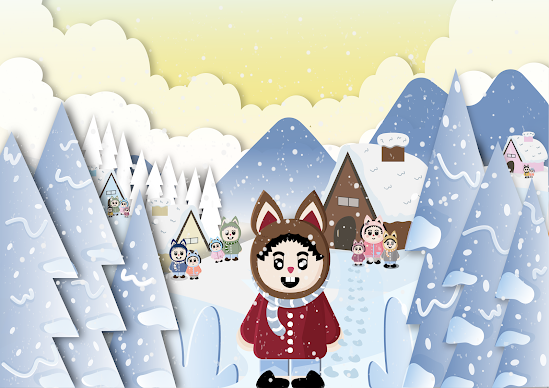
-
Pokemon Card

-
Background Story
Leo, as head of the town, he is responsible to look after the people and the security and safety. As a leader, he was respect and many look up on him because he always makesure the residence safe by setting enemy away from them and bring peace to the town. When feeling danger situation, Leo is always alert, Leo will protect the town, family and other residence with his power which is shooting out snowball to enemy for every foot step and with his power he has brought comfort and safety for everyone. For this picture, Leo is going for a fight, the family and others send him and they are all waiting for Leo to comeback soon. They are all sending love to Leo hoping Leo comback safe. Leo is very brave and fight with who smile.

.png)


5. Reflection
Komentar
Posting Komentar