Typography Task 1: Exercises

23/09/2024 - 28/10/2024 (Week 1 - Week 6)
Felice Jolin / 0373636
Typography / Creative Media / School of Design
Task 1 : Exercises
TABLE OF CONTENTS
1. Lectures
2. Instruction
Task 1 :
Exercise 1&2
Exercise 1:
Type expression
Exercise 2:
Text Formatting
3. Feedback
4. Reflection
1. LECTURES
Week 1 Typo_1_Development
- Typohraphy: the art of arranging letters and text in a way that makes the written language clear and readable.
- Font: the individual font or displayable typography in a specific style and size.
- Typeface: The whole family of fonts that have similar characteristics and styles.
Development/Timeline
-
Early letterform development : Phoenician to Roman
-
Writing: scratching into wet clay with sharpened stick
or carving into stone with chisel.
-
Uppercase: simple combination of straight lines and
pieces of circles.
 Figure 1.1.1 Letterform Development
 -
Phoenician: wrote from right to left as so like Semitic
peoples
- The greek: line text is read alternately from right to left and left to right. The Greeks developed this writing style called 'boustrophedon' (how the ox ploughs).
-
Phoenicians and Greeks have the similarity of not using letter
space or punctuation.
 Figure 1.1.2 Greek Writing Style
 -
Etruscan: uses brush to draw on stone before carving it.
Stokes changes in weight from vertical to horizontal. Modern
latin letterword is developed from this storkes.
 Figure 1.1.3 Etruscan
 -
Letterform development: Phoenician - Greek -
Roman.
Greek's letter A takes from Phoenician but flipped.Roman's letter A takes from Greeks but rotate it 90 degree.
 Figure 1.1.4 Early Letterform Development
-
Writing: scratching into wet clay with sharpened stick
or carving into stone with chisel.


-
Hand script from 3-10 century C.E.
-
Square Capital: letterform that have serifs added to the
ending of the main strokes.
-
Reed pen held with 60 degree perpendicular with boarder edge that
have slunt : give thick and thin effect.
 Figure 1.1.5 Hand Script
 -
Square and rustic capitals: written in cursive hand and were
simplified for speed. Lowercase was developed by writing fast.
 Figure 1.1.6 Writing Fast
-
Uncial: including some of the Roman cursive hand especially
the shape of A, D, E, H, M, U and Q. Latin 'twelve of anything' ;
small letters , it has no uppercase /lowercase.
 Figure 1.1.7 Uncial
 -
Half uncial: introduction of lowercase letterforms and
development of capital letters.
 Figure 1.1.8 Half Uncial
 - Charlemagne: issued and edict in 789 to standardize all ecclesiastical text.
-
The monks reweote text using uppercase, miniscule, capitalization
and punctuation to standardize writing system and to convey message
clearly.
 Figure 1.1.9 Charlemagne
-
Square Capital: letterform that have serifs added to the
ending of the main strokes.


-
Blackletter to Gutenberg’s type
Styles of writing evolution
◦ North europe: condense strongly vertical letterform (blackletter)
◦ South europe: rounder more open hand (rotunda)
From large scale u will develop your own styles from surrounding, your character and environment.
 Figure 1.1.10 Blackletter
-
Gutenberg: skillful in engineering, metalsmithing, and
chemistry. With his skills he invented modern day printing press
(Blackletter of Northern Europe
-
He developed words into sentences and made a Bible.
 Figure 1.1.11 Bibble
 -
Gutenberg: skillful in engineering, metalsmithing, and
chemistry. With his skills he invented modern day printing press
(Blackletter of Northern Europe


-
Humanist script to roman type
From a development of written scripts from decades into the era of dutch printing.


-
Figure 1.1.12 Timeline
-
Type classsification
- 1459 Blackletter : earliest printing type (based on hand copying style).
- 1475 oldstyle: based on lowercase forms used by italian humanist scholard for book copying and uppercase letterforms found inscribe on Roman ruins.
- 1500 italics: condense and close set. Italic is to complement roman forms.
- 1550 Script : replicate engraved calligraphic form.
- 1750 transitional : refinement of oldstyle form.
- 1775 modern: styles with further rationalizatiob of oldstyle letterforms.
- 1825 square seruf / slab serif: bracketed serif withvariation of thick and thin.
- 1900 Sans serif: eliminates serif alltogether.
-
1990 Serif/sans serif: enlarge notion of
family of typefaces.


Figure 1.1.13 Type Classification
Week 2 - Typo_3_Text_P1
-
Kerning: Refers to automatic adjustment of space between
letters.
- Letterspacing: Add space between letters.
-
Tracking: The addition and removal of space in a word or
sentence.
 Figure 1.2.1 Letter with and without kerning
 -
Gray Value: The value of the entire text on a white
page.
-
Flush left: This format mirrors the assymetrical experience of
handwriting. Each line start at the same point but ends whenever the last
word on line ends.
- Centered: This format imposes symmetry upon text with equal value and weight in both ends of every line. Amend line breaks so that text appeared not too jagged.
- Flush right: This format shows alignment that places emphasis on the end of the line as opposed to its start. Mostly useful for captions.
-
Justified: This format shows alignment that expands or reduces spaces between words
and imposes symmetrical shape on the text.
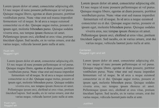 Figure 1.2.2 Formating Text
 -
Type with a relatively generous x-height: produces dark mass on the
page that typiing with small x-height/ lighter strokes.
-
Baseline: The visual base of letterform
-
X - height: The space between the baseline and line above it. The height of the lowercase ‘x’.
- Mean line / Median line : Line above the baseline. The imaginary line defining the x-height of letterforms.
- Ascender: The part of letters that extend above the x-height.
-
Descender: The part of letters that extend below the
x-height.
 Figure 1.2.3 Texture
 - Type size: Text type should be large enought to be read clearly at arms lenght.
- Arms : Short strokes off the stem of the letterform.
- Leading: Text that is set tightly, reader can easily loose his/her space.
-
Line Length: Shorter lines require less reading while longer lines
require more
 Figure 1.2.4 Leading and Line Length
- Type Speciment Book: Provide samples of typeface in various size.
- Compositional requirement: Text should create a field that can occupy a page/screen.
-
Ideal text is having a middle gray value, not a series of tripes
-
Test in size to test it out on screen and printed out if it is
readable.
 Figure 1.2.5 Type Speciment Book


Week 3 - Typo_4_Text_P2
Indicating Paragraph
-
Pilcrow: A symbol to indicate paragraph spacing.
 Figure 1.3.1 Pilcrow
 -
Leading: Also known as 'line space' between paragraph. If the line space is
10pt, the paragraph space should be 2 points larger, which is 12pt. If
the line space is 12pt, the paragraph space should be 12pt, in order to
have cross alignment across columns of text.

Figure 1.3.2 Leading
-
Cross alignment:
Text across column are in the same line, reinforce the architectural
sense of page.
 Figure 1.3.3 Cross Alignment
-
Line space is between decender of a sentence to a decender of other
sentence. While Leading is space between acender of one sentence with decender to one sentence.
 Figure 1.3.4 Line Space
-
Identation: Indent is the same size of a line spacing or point size of text.
 Figure 1.3.5 Identation
-
Extended Paragraphs: Creates unusual wide columns of text.

Figure 1.3.6 Extended Paragraph
Widows and Orphas
-
Widow: A short line of text left alone at the end of a column.
-
Orphans: A short line of type left alone at the start of new column.
 Figure 1.3.7 Widow and OrphanHiglighting Text
-
Italics, bold, bold and change the , change colour of text.
 Figure 1.3.8 Higlighting Text
-
Create a box around the text to higlight it
 Figure 1.3.9 Higlighting Text
-
Necessary to place typographic elements outside the left margin of
column of type.
 Figure 1.3.10 Typographic element
-
Indented quote and Extended quote
 Figure 1.3.11 QuoteHeadline within Text
-
A head: Indicates clear break between topics.
- A head: Set larger that text, small caps ad bold
-
A head 'extended': Shift to the left side of text
 Figure 1.3.12 A head
-
B head: Subordinate of A heads, sould not interrupt as strongly as A heads ;
small caps, italic, bold serif and bold san serif.
 Figure 1.3.13 B head
-
C head:
Not common but to highlight the specific material within B head ; shown
in small caps.
 Figure 1.3.14 C head


Week 4 - Typo_2_Basic
Basic/ Describing Letterform
- Baseline: Imaginary line/ visual base of letterform
- Median: Imaginary line defining the x-height of letterform
- X-Height: Height in any typeface of the lowercase 'x'. #1
- Stroke: Any line that defines the basic letterform. #2
- Apex/Vertex: Point created by joining two diagonal stems; apex (above) Vertex (below) #3
- Arm: Short strokes off the stem of letterform either horizontal or vertical. #4
- Ascender: Portion of stem of a lowercase letterform that project above the median line. #5
- Barb: Half-serif finish on some curved stroke. #6
- Bowl: Rounded form that describe a counter. #7
- Bracket: Transition between serif and the stem #8
- Cross Bar: Horizontal stroke in the middle to join two stem together. #9
- Cross Stroke: Horizontal Stroke to join two stems together #10
- Crotch: Interior space where two strokes meet. #11
- Descender: Portion of stem of a lowercase letterform that project below the median line. #12
- Ear: Strokes extended out from main stem. #13
- Em: Distance equal to the size of the typeface
- En: Half size of em
- Finial: Non-serif terminal of a stroke.
- Ligature: Character formed by the combination of two or more letterform.
- Link: Stroke connecting the bowl and loop of lowercase g.
- Serif: Right-angled foot at the end of strokes.
- Shoulder: Curved stroke that is not part of bowl.
- Spine: Curved stem of S.
- Stem: Vertical/oblique stroke.
- Stress: Letterform indicated by thin stroke in round forms.
- Swash: The extends strokes of letterform.
-
Terminal: Stroke without serif.


Figure 1.4.1 Describing Letterform
Basic / The Font
- Uppercase: Capital Letters
- Lowercase: Include same character as uppercase.
- Small Capitals: Uppercase letterform with x-height of the typeface.
- Uppercase Number: Number that has same height as uppercase letters.
- Lowercase Numerals: Number set to x-height.
- Italics: Base on Roman form of typeface.
- Punctuation: Some punctuation may not be available in the typeface.
-
Ornaments: Used as flourishes, found in larger typeface family.
 Figure 1.4.2 Font

Basic / Describng Typefaces
- Roman: Uppercase forms are inscripted from Roman Monuments.
- Italic: Italian handwriting.
- Boldface: Thick strokes.
- Light: Thin and lighter strokes.
- Condense: Compressed style.
- Extended: Extended variation of roman font.

Week 5 Typo_5_Understanding
Letters / Understanding letterforms
Uppercase letterform looks symmetrical but actually not after clear inspection. This typpeface (univers) letter A seems symetrycal but turns out not. The width of the left slope is thinner than the right stroke. This is to create harmony and expression.


Letter that have curved strokes need to rise above the median and sink below the baseline in order to be the same size as the vertical and horizontal strokes they are joined.

Counterform is the spaces between letters that are joined together. Better counterform ease readability. Form and counterform should be balance for letter-making.

Letters / Contrast
When dealing with diffferent information, contrast is required to differentiate it.

2. INTRODUCTION
<iframe
src="https://drive.google.com/file/d/1hEZqAWHcsPzN3_6lobCOlY4nVPiY45Om/preview"
width="640" height="480" allow="autoplay"></iframe>
Task 1 / Exercise 1: Type Expression
We are told to chose 4 words from several given. We came up with
the words - Melt, Burn, Fade, Grow. We should sketch out the meaning of
the 4 words choosen. No colours are allowed, just black and white. Use
only the 10 fonts given. First step is sketching then digitalize our idea
wih Adobe Illustrator and turn one into animation.
1. References

I begin by searching for references from pinterest and google.
2. Sketches

Figure 2.2 Sketch (Week 1, 23/09/24)
Melt: I use mostly bold and rounded fonts for this in order to make
the melting effect.
Grow: Some of them I use light font in
orer to make it simple but still expressing the meaning.
Burn:
For design #2 and #3 i design it as if a burnt paper that is ripped above
and below.
Fade:
I decide the sketch it digitally to get the perfect gradient effect.
I decided to sketch mine manually using paper before digitalize it in Adobe Illustrator, except for the word 'fade'. I find inspiration from pinterest mostly which really helps evolve my ideas. After Mr. Max approval of the sketch, I continue to apply the sketches in AI.
3. Digitisation
During sketching I match my drawings with the font that suits in, therefore when digitisation, I just need to use the font that I have sketched. Howevery, I tried with different fonts to see whether which one match more. I tried several ways to drag, pull, and make shapes in the font to get the ideal design I want.
1. Melt

Mr Max chose those 2 design from my sketches. I decided to put my sketch in AI and explore on how to make it better. For melt sketch #2 Mr. Max gave me input to combine the melted liquid with the letter itself.
.png)
2. Grow

Figure 2.3.3 Grow Digitalize (Week 2, 30/09/24)
Mr Max chose the first option from my sketch and told me to explore more with simple idea of growing from big to small, then i came up with the design #2. I explore several design with arrow and after several trials and errors, I come up with idea of making arrow cutting the word 'GROW'.
3. Burn

Figure 2.3.4 Burn Digitalize (Week 2, 30/09/24)
Mr. Max approved these 2 sketches for me to digitalize it. I explore several shapes of fire to suit in best with my font (Gill Sans). For design #1 Mr. Max suggested me to make the burned part more pointy to make it look more realistic.
.png)
Figure 2.3.5 Burn Digitalize (Week 2, 30/09/24)
4. Fade

Figure 2.3.6 Fade Digitalize (Week 2, 30/09/24)
For 'FADE' I do not make it manually however directly into digital. Mr. Max chose design #2 and told make it more faded (spreads in all of the letters, not just in 'F').

4. Final Type Expression


Mr. Max suggested me to add frames for the droplets in the letter slower to evolve and showed me the example, then I came up with the forth and last attempt and make the time of each frame faster to make it better.
.png)
.png)
I ended up with 15 frames in for the transition to go smooth and put the very first frame and last one the same as to make it more natural.
Final Animated Type Expression

For second exercise we are introduced to use kerning, tracking and leading in Indesign. Using our name, we should make kerning, tracking and leading with the 10 typefaces given.
1. Kerning and Tracking
We are to make one final layout using text formatting such as kerning, tracking and leading. Make sure there is no widow, orphane and rag be seen. Line length should be around 50-60 and remember to turn off hyphenation to ease reading. If using justify make sure there are no rivers (large space between words).


Headline
Typeface: Bembo Std
Font/s: Bembo Std Bold
Type Size/s: 72 pt
Leading: 36 pt
Paragraph spacing: 0
Body
Typeface: Bembo Std
Font/s: Bembo Std
Type Size/s: 9 pt
Leading: 11 pt
Paragraph spacing: 11 pt
Characters per-line: 50-60
Alignment: left justified
Margins: 123 mm top, 26 mm left + right + bottom
Columns: 2
Gutter: 10 mm


- General Feedback: Mr.Max show and help us on how to make our own blogger.
- Specific Feedback: I was having hard time when log in blogger, the web crashed evrytime I tried to login. Mr.Max suggested me to use another web browser and it did works.
- General Feedback: 7 sketches were accepted and 4 to be continue digitisation in AI. Mr.Max taugh us detailed about the important tools ansd shortcuts in AI. Also on how to apply our sketches into AI.
- Specific Feedback: I drew in total 36 sketches and 2 of burn, 2 of melt, 2 grow and 1 of fade is approved by Mr.Max. Mr.Max told to chose 4 to digitized however I feel like to digitize all 7 and he agreed. At first Mr.Max just approved 1 of my 'grow' sketch and gave me suggestion to make something growing horizontally. For fade, Mr.Max told me to make all the four letters fade not just in letter 'E' like I initially made. Mr.Max said overall was good.
- General Feedback: I have digitized 4 words and Mr.Max gave suggestion to revise the word 'melt' and 'burn'. After revised Mr.Max approved the words and let me choose one word to start animate.
- Specific Feedback: For 'melt' Mr.Max said that the fallen liquid is quite long so suggested to make it shorter. While for 'burn' the burnt part above every letter is not very natural, so Mr.Max told me to make it more pointy. I revised as suggested and Mr. Max has approved.
- General Feedback: I animate the word 'melt'. Mr.Max said it was good but not that smooth.
- Specific Feedback: Mr.Max said that the falling liquid is already natural, however the droplets in the letters need improvements. Mr.Max suggested me to make more frames for the droplets in the letter, make it slowly changing, from small into big ones. Mr.Max also showed me an example. I revised and Mr.Max approved the animation.
- General Feedback: Animation is done, next Mr.Max gave tutorial for Text Formatting eaxercise.
-
Specific Feedback: My layout is ragged Mr. Max told to sue left allignment, also I'm confussed if my paragraph is conidered to have widow or not. Mr.Max said that if the word in the last line is quite long than there is no problem.
- General Feedback: -
- Specific Feedback: Mr.Max said my last layout is good and to proceed as the final layout.
4. REFLECTION
-
Experience: I was having a hard time to creat my own blogger in the first week, however managed it with the help of Mr.Max. I was also quite frustrated when my Adobe Illustrator can't be downloaded before.That was the struggle part but after that I enjoy the experience throughout exercise 1 where I am could come up with design of my style and expressing it on my way. Nevertheless, it was quite challenging because we are limited to use only given typefaces, where we are not 100%ree to create our own. Meanwhile for exercise 2, I was a first timer using Indesign however Mr.Max always gave a clear explanation that we can easily follow. Mr.Max always encourage and give us time to practice, also allowed us to express our concerns.
- Observation: Mr.Max always gave us consultation time every class to get our feedbacks. I also observe that even only one typefaces could describe contradict things from different people's outcome. Moreover, during classes I could share ideas with other peers, see their progress changing point of view, looking at how they actual see things and also making myself more competitive to give the 'best'.
- Findings: I am a word affirmation person, I do love beautiful words and value words and message they carry. In addition task 1 encourage us to better express a word therefore i realy enjoy this exercise. Typography is not just learning about font and typefaces. However, it makes people understand the word by seeing the it without actually knowing the meaning. Along classes I also get to know that there is many ways to do a thing. Like about shortcuts that could ease deasigner to design. Throughout this classes I have learnt many technicalities of typography that I could apply in the world of typography. Lastly, I realize that simple things could mean more.
5. FURTHER READING
5.1 Typography Basic
.png)
tified Expert for Photoshop, Illustrator, Acrobat,InDesign, PageMaker, FrameMaker and an authorized QuarkXPress trainer (since 1988).
.png)
.png)
.png)
.png)
.png)
.png)
Old style: Evolved from Italian Type design and also influenced by Roman capitals and 15th centuriy human writing.
.png)

p.png)
Modern: This typeface has strong geometric quality and shows significant difference between thick and thin strokes.
.png)
.jpg)

Komentar
Posting Komentar