Typography Task 2 : Typographic Exploration & Communication
Felice Jolin / 0373636
Typography / Creative Media / School of Design
Task 2 / Typographic Exploration and Communication
TABLE OF CONTENTS
> LECTURES
Week 6 Typo_5_Understanding
Letters / Understanding letterforms
Uppercase letterform looks symmetrical but actually not after clear inspection. This typpeface (univers) letter A seems symetrycal but turns out not. The width of the left slope is thinner than the right stroke. This is to create harmony and expression.
Letter that have curved strokes need to rise above the median and sink below the baseline in order to be the same size as the vertical and horizontal strokes they are joined.
Counterform is the spaces between letters that are joined together. Better counterform ease readability. Form and counterform should be balance for letter-making.
Letters / Contrast
When dealing with diffferent information, contrast is required to differentiate it.
Mr. Max showed us tutorial of making composition layout in Indesign also chose our sketches for headlines.
<iframe
src="https://drive.google.com/file/d/1hEZqAWHcsPzN3_6lobCOlY4nVPiY45Om/preview"
width="640" height="480" allow="autoplay"></iframe>
> TASK 2
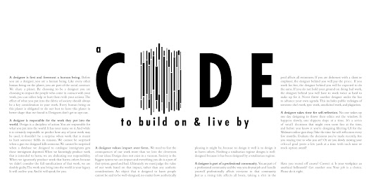
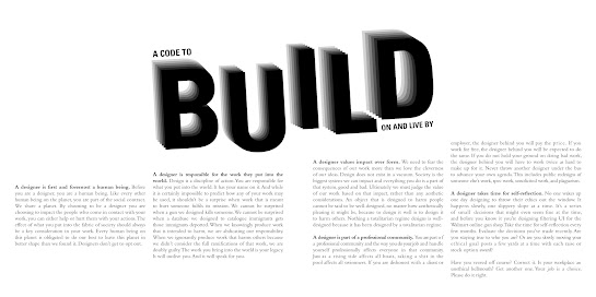
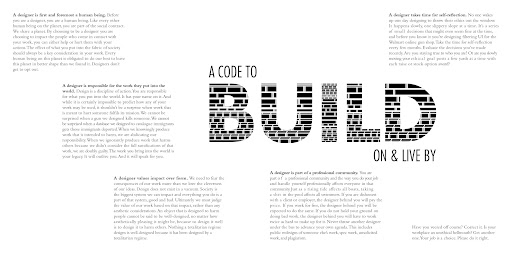
For task2, we needed to create a two-page editorial spread (200x200mm). We were provided with 3 different texts and I decided to choose the text with
the headline "A code to build on and live by". We were told to design the headline's type expression in Adobe Illustrator,
and then arrange the text formatting and layout in Adobe InDesign.
References
For the headline I chose, I decided to explore the word 'build' and 'code'
where I find some inspirations from pinterest and google.
For design 1, to highlight 'code' I use elements barcode to appeal the headline. As for design 2 and 3 I explore with long barcode to enhance the expression of the headline. I also explore with the word 'build' where in design 4 and 5 I tried to make it look 3D to make it look like a building with difference sizes. While for design 6 it is more to a slanted building.

Fig 2.2 Sketches (Week 6, 28/10/24)
In AI I explore more in 'build' I tried different styles and also typefaces to get the best one.
After showing Mr. Max the progress he chose this 4 designs. For my headline I mostly use Futura typeface.
Layout sketch
After finilazing the design for headline I proceed to try different layouts. For layout 3 and 4 I want to project the shape of building itsleft.
Indesign Layout
From the sketches I develop the layout into many forms, I trial and error to see which one fits the most. At first, I stuggled organizing the paragraph, however, I search more inspirations from pinterest and came up with these designs :
After showing Mr. Max, he like design #2 and #3 and told me to tidy up the
parraph and let me to chose myself either that two for the final one. Mr.Max
suggested me to not cut the paragraph in the middle, put it as a whole.
Final Outcome
Leading : -
Paragraph spacing : -
BODY TEXT
> FURTHER READING
A Type Primer, by John Kane. I read about formatting text, texture,
typfaces, composition and proportions from this book which helps me with
doing Task 2.
Fig 3.1 A Type Primer, John Kane
Formatting Text
Keep clear and appropriate presentation of
author's message is important, if you see type before the word, change the
type. Different typeface suit different message.
Fig 3.2 Text Formatting
Texture, Leading and Line Length
Bigger x-height and heavy stroke width portray darker mass on page
and is fundamental for layouts. Text should occupy page as much as a
photograph, middle gray value (above, left). Remember to enlarge type on
screen to check relation between descender and ascender below. Printed out
will be better to closely check. Mr.Max also remind us about this, on
screen and printed out can look very different.
Fig 3.3 Leading and Line Lenght
Proportion
Golden section existed since classical time,
used by architects and visual artist for composition at all cost, from
page, shape to building. a : b = b : (a+b)


.png)
.png)


.png)


.png)
.png)
.png)
.png)
.png)
.png)
.jpg)
Komentar
Posting Komentar