DPI - WEEK 7 - Double Exposure

Felice Jolin
Week 7 (5/11/24)
Digital Photography and Imaging
Project 2 / Exercises
TABLE OF CONTENT
WEEK 7 - LECTURES (05/11/24)
1. Double Exposure
Double exposure is merging multiple images such as featuring silhouette.
You don't need a double exposure camera to do so, you can do it in
Photoshop.
- Using tilt-shift effect
This is a soft artwork where you merge
picture and blur one of them.
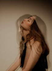
fig.1.1.1 Tilt-shift effect
- Create fake reflection
One of the way to mae reflection is creating a double exposure
with seperate window photo.
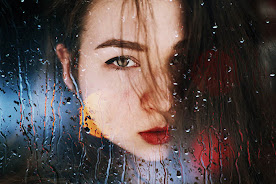
fig.1.1.2 Reflection
- Experiment with simple portait and detailed texture
Combining plain photo with texture background will
make balance.
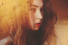
fig.1.1.3 Portrait and Texture
- Convert result into black and white
Sometimes less colour will give out more emotion.
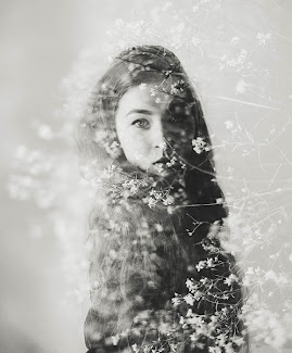
fig.1.1.4 Black and White
- Work with Silhouette
Silhouette only could be attractive in its own way of creativity.
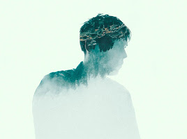
fig.1.1.5 Silhouette
- Pick two random photos
Sometimes random photos results good and led to creativity growth.
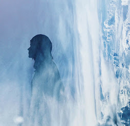
fig.1.1.6 Two Random Photos
- Make simple object look fascinating
Make a silhoutte of an object and play with imagination.
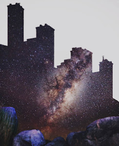
fig.1.1.7 Simple Object
- Use shadow
Take photos of shadows and transform it into story.
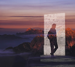
Fig.1.1.8 Using Shadows
2. Colour Theory
- Colour wheel is to represent the relationship between colours

Fig.1.1.9 Colour Wheel
- CMYK (cyan, magenta, yellow and black) these are primary colours of printng. RGB (red, green, blue) these are colours used to display on computer screen.

Fig.1.1.10 CMYK & RGB
- RGB is additive colour mixing model. Colours is made up of mixig red, green and blue light sources of intensities, such as is TV, screen and projector. They are usiing RGB as primary colour.

Fig.1.1.11 RGB
- CMYK (Subtractive colour mixing model), CMYK colours is used for printing, these colou sis created by substraction of light.

Fig.1.1.12 CMYK
- Hue is the most basic of color terms and indicates colour of an object’s. Shade is a hue that is added with black. As an example, red plus black becomes burgundy. Tone is hue added with black and white (or simply grey). Tint is a hue that is added with white As an example, red plus white becomes pink.

Fig.1.1.13 Hue, shade, tone, tint


- Colour Harmony where The arrangement of the colors in design in the most attractive and effective way for users’ perception.

Fig.1.1.14 Colour Harmony

- Monochromatic is a colour that is difficult to make mistake and is not likely to unpleasant colour scheme.

Fig.1.1.15 Monochromatic

- Analogous is 3 colours located side-by-side of the colour wheel. Where one of the three colours prdominate.
Fig.1.1.16 Analogous


- Complementary colours and opposite to each other and they give a significant contrast.

Fig.1.1.17 Complementary Colours


- Split-Complementary is using the three colours. Start with one color, find its complement and then use the two colors on either side of it.


Fig.1.1.18 Split-Complementary Colours
- Triadic colours is evenly spaced colours around the wheel and is usualy bright and dynamic.

Fig.1.1.19 Tradic

- Psychology of colours, colour have ability to show specific emotion and attract people's attention.


Fig.1.1.20 Psychology of colours
- Warm VS Cold Colours,
spread throught the center of the wheel to get warn and cold.

Fig.1.1.21 Warm vs Cold

Warm colors shows feelings of happiness, optimism and energy. Cold colours are usually calming and soothing but can also express sadness.


Fig.1.1.22 Warm vs cold
- Black is mostly used or text – but also works as a primary colour element such as for backgrounds. It add air space, elegance and bold into design. While white give sense of clear, clean and virtuous. White also could be mix and match with any colour which make it as a secondary colour.


Fig.1.1.23 Black vs White
Tutorial were given through youtube video, where step by step is shown to do double exposure. Link: https://youtu.be/y2JuZUhZWZY?si=9aOCWIcC2S1BmkmL
WEEK 7 - PRACTICAL
We were to do double exposure exercise, utilizing all materials we have
learned such as selection tool, masking tool, refine edge tool, adjustments
(levels, curve), and also brush tool. Following the video tutorial, we
should do the same thing for Part 1. While for Part 2, we were to use our
own photo to make double exposure image.
Instruction:
1. Take your own portrait photo
(portrait mode)
2. Collect Bacground
images online (high resolution)
3.
Import all images to Photoshop and convert to black & white/ monochrome
(can be mixture of colour
with b&w
4. Make your own double exposure photo
5. Image can be landscape (1920x10800 or portrait (1080x1920)
Exercise 1
Using pictures and method given from teacher.
Below shown is example from teacher :
.png)

.png)
Below is the original picture that I try to make different styles of double exposure with.

fig 2.4 Photo
Below is the elements I use :


fig 2.8 Mountain #1

fig 2.9 Mountain #2
I first select and mask the subject, continue with inserting background
picture, create clipping mask and then play with the brush to make double
exposure effect. Then lastly I add elements to enhance the visual.
First :

fig 2.10 Attempt #1
.png)

.png)
fig 2.13 Adjustment

fig 2.14 Attempt #3
.png)
fig 2.15 Adjustment

fig 2.16 Attempt #4
.png)
fig 2.17 Adjustment

.png)
fig 2.19 Adjustment

.png)
Komentar
Posting Komentar