
Week 1 - Week 3 (03/02/25 - 17/02/25)
Felice Jolin (0373636)
Design
Principle / Bachelor of Design (Hons) in Creative Media
Task 1 - Exploration
TABLE OF CONTENT
Lectures
Instruction
Task 1 / Exploration
Feedback
Reflection
LECTURES
Visual communication is about design that is used to deliver message to
the audience. Element of design is the individual building block while
principle of design is a basis that guide the arrangement of the building
block.
Point is the simplest element of design used as a repetitive mark
to form a line, two and three dimension figure.
Line it
can be active or static. Lines can indicate direction, define boundaries
of shapes and spaces, imply volume or solid masses and could
give sens of motion or emotion. A group of line could also depict
qualities of light and shadow which form pattern and texture.
Shape is the expanse of outline of 2D or 3D area. Shape
could be seen of the lines enclose an area or a cngane in value
(lighness/darkness). There are geometric (circle, square, triangle) and
organic (irregular) shapes.
Form is a three-
dimensional area. It encloses space which which is volume.
Texture is the tactile quality of surfaces which can be experience by touching or
through visual. There are two categories of texture which are actual
texture (experienced by touch) and simulated or m=implied (created to look
like the real texture).
Space : is defineable, it is the empty space around us. The space
we experience inside is volume, while the space we experience outside is
called mass. Space can be defined as positive (filled space) pr negative
(empty space)
Colour is a visual byproduct of the spectrum of light as it is either transmitted through a transparent medium or as it is absorbed and reflected off a surface.
Hue :pure colours of the spectrum (yellow, green).
Value : lighness and darkness of colour (white-greys-black).
Tint : pure hue + white
Tone : pure hue + grey
Shade : pure hue + black
Intensity : also called saturation/chroma is the purity of colours.
Monochrome : variations in the value and intensity or one hue.
Adjacent : colours adjacent to one another.
Complementary : colours opposite to each other on the colour wheel.

Fig 1.1
Elements of design
INSTRUCTION
We are required to describe each of the design principles listed in the
module and select suitable design examples to demonstrate your
understanding.
Also Select an art/design work that piques your interest and explain in a
writeup of 150-200 words
Principles of design
It is the strong difference of design element that could make viewer
focus into certain point that is emphasized. Contrast can be through
colour, shape or texture. For instance, a bright colour object with a dull
colour background is a good contrast that can stand out the object.
Explanation of Fig 2.1.1 This design shows contrast in colour, where
the background uses contrasting colour such as bright and dark colour. The
yellow background is very bright, however the character in front is in black
colour which is very contrast to yellow and makes it stands out.
Explanation of Fig 2.1.2 This design
shows contrast of dark colour of the wall and bright coloured sofa. Texture
contrast is also showed by rough texture wall and soft texture sofa and
furniture. There is also contrast shown in different shapes of tables and
lamp.
Gestalt is the shape, form.
This principle describe how the human eye
perceives elements and the relationship between objects. This principle aims
to show objects perceived in simplest form such as a united form. Also the
theory for the human eye to see a complete shape where our minds tend to
fill in missing details. There are several principles of gestalt theory such
as principle of similarity, continuation, closure, proximity, figure/ground
and symmetry
Principle of similarity : Principle where similar elements are
perceived as a group or pattern.
Explanation of Fig 2.2.1 This design
show similar elements of cicrlces that looks as a pattern.
Principle of continuation : Principle where our eyes move and
follow the path, line, or curve of a design.
Explanation of Fig 2.2.2
In the design , our eyes as if following the path of the road, from far,
towards the front.
Principle of closure : Closure occurs when elements are incomplete
and the audience could perceive it as a complete element by filling in the
missing details.
Explanation of Fig 2.2.3
The design below is shapes of pentagon however placed accordingly that
make our mind fill in the lines so we could see the shape of a
football.
Principle of proximity : Principle where related elements are
placed together and unrelated one spaced apart.
Explanation of Fig 2.2.4
The design below shows related words come together to form a shape of the
bottle.
Principle of figure/ground : Object is seen as either foreground
and background. If a shape is the figure, the rest area is perceived as
ground.
Explanation of Fig 2.2.5 In this design, we could see two images, where there are 2
people's head and also the swan.
Explanation of Fig 2.2.6
The image shows a nib of the pen also we can see a light bulb.
Principle of symmetry : Principle where elements that are
symmetrical to each other tend to be seen as a group. Symmetrical
elements are easier to be group than elements not symmetrical with each
other.
Explanation of Fig 2.2.7
This poster is evenly divided into 2 parts but with different
style.
Explanation of Fig 2.2.8
The design below shows that symmetry of both left and side are equally
in size and elements.
Balance is a visual weight of elements in a design work. It is the
visual equilibrium in a design that creates stability. There are two
types of balance such as symmetrical and assymetrical.
Symmetrical balance is when elements have eual arrangement on
both side of the central axis. Elements could radiate outward from the
central point and is called radial balance. While apparoximate symmetry
tend to look like a mirror image but actually not exactly the
same.
Explanation of Fig 3.1.1 The picture shows symmetry because the
both side from central axis has the same figure or shapes.
Explanation of Fig 3.1.2 The picture shows radial balance
because all the elements radiates from the centre and form a ciruclar
design.
Explanation of Fig 3.1.3 The picture shows approximate symmetry
as the mountain on the left side and right side has slight size
different. There is also car on the left lane while not on the right
lane.
Asymmetrical balance : Show unqueal weight on a design. One side
might have dominant look while the other side balanced it using a lesser
dominant one.
Explanation of Fig 3.1.4 The poster below shows the big
character of baymax on the left side but balance with the typography on
the bottom left.
Golden ratio is a mathematical concept that is known to represent the
perfect beauty.
It is a ratio between two numbers that equals approximately 1.618.
With golden ratio it is said to bring visual balanceand harmony to a
design work.
Explanation of Fig 3.2.2 The example shows that it applies the
golden ratio. The face of the woman is in the small spiral of the circle and
the dress flow as the line in the golden ratio.
.png)
Fig 3.2.3 Golden Ratio
Rule of third applies to the composition of a design. There will be lines
dividing images into nine parts (divided evenly into thirds horizontally and
vertically). Therefore, the focal point is in the intersection of the
vertical and horizontal line.
Explanation of Fig 3.3.1 The ball falls on the intersection of the
horizontal and vertical grid and made a good composition.
.png)
Fig 3.3.2 Rule of Third
Emphasis gets viewers attention because they create dominance and focus into
particular elements in a design work through colours, lines and shape.
Explanation of Fig 3.4.1 This design show the red circle as the
contrast and is emphasized, therefore our attention is to look at it first.
Explanation of Fig 3.4.2 The dominance in the above picture is the 5
people in the spotlight in a bright colour whcih makes it stand out from the
dull colour behind.
Repetition is when we are reusing same or similar element throughtout
design. However, if only with same elements throughout the design it will be
monotone, therefore variations is needed where a slight difference enhance
the visual. This create rhythm and pattern which piques interest.
Explanation of Fig 3.5.2 The design above showing the repetition
shape of a man diving which shows rhythm.
Movement is the path that leads our eyes from one element into the other
element. It leads our eyes around and through the composition with lines,
shapes, forms and curved used in the design.
Explanation of Fig 3.6.1 This is just a 2D picture in the
screen however it seems like giving the effect of the arrows moving
forward to the top right edge corner.
Explanation of Fig 3.6.2 I think this is a good design that implies
the golden ratio rule, as the spiral is the logo, also utilizing the
movement of the men and sword well to the direction of focus which is the
logo.
Hierarchy direct our eyes to the most important information first and lead
us to the next important one.
Explanation of Fig 3.7.1 The word 'Bauhaus' is the main visual
hierarchy as it is the biggest in size, followed by the informative details in
a smaller size. Note that the pattern on right side is also a strong visual
hierarchy.
Explanation of Fig 3.7.2 The product is the main visual hierarchy,
followed by the name of the product, its ingredients and other details.
Allignment is when elements are placed in a line along rows or columns to
show unity, cohesion and stability. It is also good to lead eyes through a
design.
Explanation of Fig 3.8.1 This poster apply right side allignment of
the text but with variations which the word is slightly rotated. This shows
cohesion and still clearly shows the information.
Explanation of Fig 3.8.2 In the design, the centred allignment of
text and elements make the product easily identified.
Harmony is when the elements are related which share common characteristics
and fits together. However, there should be variety to add interest which
could be variety of angle, exposure, and composition.
Explanation of Fig 3.9.1 The interior shows harmony as it is using
analogous colour and related objects such as leaves, pot and green
painting.
Explanation of Fig 3.9.2 The design shows harmony as it uses
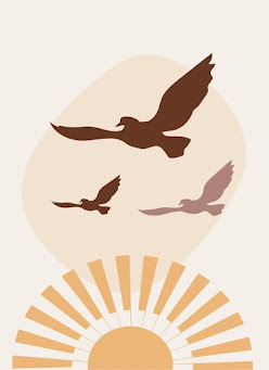
related elements such as the sun, sky and birds, also using same hue
colours.
Explanation of Fig 3.9.3 The picture have warm tone with related
elements that fits together like the sweater, coffee and book.
Unity is the repetition of particular elements in a design, whether in
colours, shapes, or materials. Unity occurs when elements are composed
in a balance and cohesive composition which makes it come together.
Harmony and unity sounds similar but actually play a different role in a
design.
Explanation of Fig 3.10.1 From this
youtube video, it is said that the left picture has the same men colours which
portray unity while the picture on the right with the men with same
colour palette shows harmony.
Explanation of Fig 3.10.2 This design shows unity as it is using
analogous colour and repetition of the men but with variation to show
balance but still interesting.
Explanation of Fig 3.10.3 The design above shows many icons and
text yet still looks harmonious as it is consistent in the colour, icons
and grouping information.
Explanation of Fig 3.10.4 In the design above, the use of same
typeface, effect and placed closely together form unity.
Explanation of Fig 3.10.5 In the design above the use of same
typeface and colors also with the same icons shape like elements bringout
the sens of fitting together and unity.
Scale refers to the size of object compared to the other object in a
design. it is the size and dimension of figures and form.
Explanation of Fig 3.11.1 The picture above clearly shows the
difference in size of whale and boat.
Proportion is the size of parts of an object in relationship with the
other part of the same object.

Fig 3.12.1
Proportion
Explanation of Fig 3.12.1 In the design above, I could tell that
the head is quite big for the body size. The head is still the part of
the object itself which have its own different size.
Explanation of Fig 3.12.2 As it is the main feature, the
pineapple occupies the largest space to the smaller text.
Symbol tells information in the simpliest way equivalent to one or more
sentences of text. There are many ways that symbols could represent
something such as in a form of shape, sign or object.
Since
long time ago, symbols have been used to communicate a message, thoughts
or any ideas. In modern days, it is mostly represented by logos of
products as an icon or for signs of ettiquette and rules.
There
are several types of symbol such as pictorial, abstract and arbitrary
symbols.
Pictorial symbol is image related and simplified
picture
Explanation of Fig 3.13.2 Pictorial symbol is a good use for
education as it could convey message clearly. The design above shows that
the more we read, the more we exceed beyond our potential.
Abstract symbol looks like the object they represent but with lesser
details.
Explanation of Fig 3.13.3 The 2 symbol really represent
the object in real life.
Arbutrary symbol does not resemble the actual object at all. They are
invented, iven names and definition that we should learn to know it.
Explanation of Fig 3.13.4 These 2 symbols is invented and given
names that we all know nowadays as wifi and bluetooth.
Selecting the right words to accompany image is very crucial to deepen the
meaning of a design. The use of appropriate typeface and strategic type
placement creates visual hierarchy and ensures balance in composition. The
words that could be seen reflected in the image are best.
Image is very important in a design because it could relate to
the concept if used in a right way.
Explanation of Fig 3.14.2 The word 'the sun set glow' is supported
with a very strong image of the sea with shining lights. It makes the
poster easily understood.
Art/design work that piques my interest
Title : Moby
Dick
Artist/designer name : Toni Art and Design (Toni Danilovic)
Year : 2019
Size : -
Medium : Digital Art
Why I choose this design work ?
I chose this poster because at first, the quote above catch my attention
as it made me read it for twice and I personally think that it is really
reflected in the illustration. I love how the design could make
viewer (me) imagine different kinds of situation for the poster itself.
It is simple yet meaningful.
Before searching about the novel - I love the meaning of the quote
itself where it portrays as if we were the whale, illustrating us
seeking back old times/experiences all over the vast sea where actually
everything lasted in our memory. (well at least this is how i see the
meaning of the poster without reading the book itself).
Another idea I got after watching the video summary of the novel - The
layout shows it could have another meaning where the whalers were
looking everywhere for the whale to take revenge not knowing that it is
always there all the time. (everything goes back to our minds, our
obssesion to revenge, not wanting to let go, we are not fighting
anything else but our ownself) (made me realize the real
destination of Captain Ahad is not the whale or any places, however
something deeper going on in himself, his anger and desire to revenge
and not letting go.)
Briefly, the story is about Captain Ahab who wants to take revenge on
the white sperm whale (Mobi Dick) that took off his leg. Just because of
that one desicion to revenge and refuse to let go it affects
everyone around you. During the encountered with Mobi Dick
Ahad and all his crews were killed and left is Ishmael to tell the
story. Why I was very attracted to this work of design is because the
meaning behind it is very related to human situation - can't let
go.
Design principles applied :
There are several principles of design that I could tell from this
poster.
-
Contrast, Emphasis and Harmony
The colour used at the background is very contrast - dark
blue sea and red background, in addition makes the whale with
contrasting white colour stands out. This also shows that the
white whale is the main focus and emphasis of the story. I do see
harmony in this poster as it uses the combination of warm and
cold tone. Red colour that shows danger and passion, dark blue ocean of
the mystery and white colour of the fate. It reflects the intense
obsession of Captain Ahab against the cold, vast nature of the ocean and
the whale.These colours is used repeatedly also with all related
elements applied which make things fit together.
.png)
Fig 4.2 Contrast, Emphasis and Harmony
The contrast in colour black for the boat reflect
figure/ground with the white whale. The boat with the whalers
(in black) within the tail shape (in white) create a contrast,
emphasizing the people through negative space. The white whale tail
also showed as the figure, while the red background acts as the
background. Gestalt (closure) also apply where it was only
shown tail, however our minds can tell the hidden part with that
little part that it is a whale.
Firstly, we see the biggest size - the whale's body that brings us to
read the quote that consist the word 'down' which made us look down
again on the whale's tail (movement) which brings us to see a boat on
the sea and to the point of the Title of the book itself. The way it
is composed inevitably made us to see the whole scene and the title.
.png)
Fig 4.4 Hierarhy & Movement
-
Balance and Rule of Thirds
Approximate symmetry is seen as it is not 100% same on left
and right from the central point however looks similar. The rule of
thirds is also applied. The whale is particularly placed in the middle
of horizontal and vertical lines drawing immediate attention. Followed
by the waves that occupy the lower third of the poster which creates
balance composition. (darker colour occupy smaller portion)
Fig 4.5 Balance & Rule of Thirds
Lastly, I could say it is showing priciple of scale where it
differentiate the big sized whale and the small boat but still shows
balance for the overall design. This also shows the big is the
danger (the whale) versus the very tiny human.
Fig 4.6 Scale
back to top
FURTHER READING
Source References
:
FEEDBACK
Week 1 : No feedback. Briefing of task 1.
Week 2 : Nice examples but some picture are small some are big, can
clear things up more tidily.
Week 3 : Dr. Charles suggest us to not be too textual to explain
about the art that piques our interest, instead shwoing how it attracts you.
Dr. Charles gave me more insight about 'letting go' in the context of Mobi
Dick. Also added that I could include more of the narrative and how and what
proceed the idea of the composition.
REFLECTION
Experience
I have a great experience exploring about design principle, there are some
that I am familiar with, but also some that I am new to. It is giving me a
new perspective of visualizing a design , I am more paying attention to
details and the reason why it is designed that way.
Observation
I've come to observe and search more informations about design principle to
depeen my understanding also practice applying it in design as
because only theory can be understandable but when execute could be
different. I also could observe how my peers interpret design principle and
could share our thoughts.
Findings
Design principle is not a fixed rule, it is a guide for us to make a better
design. The rule is there for us to create and apply in our creativity.
Througout this process I have more understanding about design principle and
become a more observant person (in terms of design).


.png)
.png)


.png)


.png)
Komentar
Posting Komentar