Interactive Design / Exercise 1
.jpg)
Week 1 - Week 2 (23/04/25 - 30/05/25)
Felice Jolin (0373636)
Interactive
Design / Bachelor of Design (Hons) in Creative Media
Exercise 1
TABLE OF CONTENT
LECTURES
Week 1
No Lecture
INSTRUCTION
Module Information Booklet
TASK
Ecercise 1 - Web Analysis (20%)
We were assigned to analyze five websites from the given links below :
2. CSS Winner - Website Awards - Web Design Inspiration - CSS Awards
4.
Awwwards - Website Awards - Best Web Design Trends
Take notes of the website's purpose, design, layout, content and functionality in a brief summary of our findings. Identify the strengths and weaknesses of the website, and consider how they impact the user experience. Write a brief report summarising your findings and recommendations. Write in a brief summary of 200 words for each website.
What to have in the analysis :
Consider the purpose and goals of the website (effectively communicated to the user).Evaluate the visual design and layout of the website (color, typography, and imagery).Consider the functionality and usability of the website, (navigation, forms, and interactive elements). Evaluate the quality and relevance of the website's content (accuracy, clarity, and organization).Consider the website's performance (load times, responsiveness, and compatibility with different devices and browsers).
Chosen Websites
1. Baci Baci Matera
https://bacibacimatera.com/
2. OH Architecture
https://www.oharchitecture.com.au/
3. Eislab
https://eis-lab.de/en-us
4. Duchateau
https://www.duchateau.com/
5. Sunmetalon
https://sunmetalon.com/
1. Web Analysis of BACI BACI
.png)
Fig 1.1 Homepage of Baci Baci Matera (https://bacibacimatera.com/), Week 1 (23/04/25)
(5).png)
BACI BACI is a cosmetics and personal hygiene products. They are the Fratello Sole Cooperative, supporting people with addictions and psychiatric disorders since 1982. Their purpose is social reintegration through therapy and skill-building, helping individuals regain confidence, independence, and connection. Also for over 10 years, donkeys have played a key role in their journey. Their calming presence and therapeutic power offer comfort, trust, and emotional support. Through onotherapy (donkey riding) , they see remarkable progress in our community.
Therefore they come up wit a tagline sound 'Donkey Milk Cuddle' where BACI BACI goal is to nourish and hydrate your skin with natural, paraben-free, petrolatum-free products also as a choice of healthy &original gift. This website includes the details of products, their background, advice/feedbacks from customers and lastly contacts.
(4).png)
The design looks very fun and playful. Attractive yet informative, as in the homepage you can already tell it is a skincare producs.
It gives a sense of contemporary but also minimalism design layout with good amount of white spaces that emphasize the clean and clear informations in san serif fonts, therefore this website is effectively communicative.
There are mainly 2 fonts used. The first one is script font with casual and playful look to give sense of attravtiveness (left picture). While for the font on the description (right picture) looks more neat and clear with variations of bold and regular.
The combination of soft pastels and vibrant colour give a fresh look which is ideal for skincare. In addition, there is only minimal images use to support the information.
(3).png)
Functionality & Usability :
(1).png)
As it has a minimalist feels, the navigation bar is clearly seen at the top. However as we scroll down, the navigation bar will dissapear where I think it would be better if it stays still for quick access.

Nevertheless, the background image keeps changes and these icons have small animated movements when we move the cursor which makes people curious about the product and to know more. Althoughi i feel that the icons are not to be clicked which makes it not really interactive.
(2).png)
However, for the product section, we could slide the product to see a different style.
Quality & Relevance Content :
This is a high-quality website with clear information and clean visual that gives a good user experience.
Content is clear and organized, given the brief background of how it all started and with the goal and purpose which alligns to satisfy target audience specifically to those who need to pamper one self.
Performance & Load Time :
From laptop, the load time is quick, no lagging.While from phone the load time is slighly delayed.
The experience and interaction using mobile and desktop are the same except for the homepage display which only shows one product in phone.
.png)
.png)
Purpose & Goal :
.png)
Visual Design & Layout :
.png)
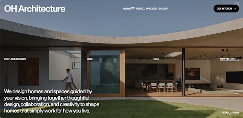
The design has contemporary and minimalist look, tidy, clean and very straightforward which clearly reflects their style of architecture.
.png)
Simple layout with clean white space makes us focus on important information. Colour used is light, neutral and earthy tone (from images) combined with black and bold colour fonts to set in contrast.
.png)
To enhance the look, san serif fonts are used for simplicity.
.png)
Provided with high quality images reflecting the studio's work and
aesthetic.
Functionality & Usability :
(1).png)
Website function very well and easily accessible to all the features. Navigation bar can be seen on top of the page. It is interesting that there are many stage to stop from just clicking an image. It guides us to the informations and aesthetic pictures.
(2).png)
They really pay attention to small details like the icon 'scroll down' on bottom right which somehow helps when people taught they should just click on anywhere to move on.
(3).png)
In addition they have this interactive gallery that brings us to see the process work.
Quality and Relevance Content :
This is a high-quality website with clear information and clean visual that gives a good user experience.
.png)
The combinaition of images and words in the website effectively communicate the content. The web could be somehow persuasive for one to go through the website because it's like going through a journey.
Performance & Load Time :
(4).png)
Load time is quick, no lagging and all icons interact well. Overall the features in both mobile and desktop is similar.
Conclusion :
Strength - Content and design style is relevant. Combination of natural colour of picture and bold text give contrast and emphasize information. Interactive pictures and description with overall content easily delivered and as if scrolling into a journey.
Weakness - Overall I think it is a good website, but if to say anything that can be improved maybe add more variations of font sizes, still minimalist but add a slight dynamic.
3. Web Analysis of Eislab :
.png)
Purpose & Goal :
(5).png)
Elslab wans to create an ice cream with unforgettable flavor experiences, built on a strong foundation of expertise and a clear vision for the future. It's more than just an ice cream, it's about the moment of joy. Their goal is to blending innovation with tradition and produce the best ice cream creation crafted to the highest standards of quality and sustainability. While not only varieties that taste great but also with surprises that gives lasting impression.
Visual Design & Layout :
.png)
.png)
While not all the pages are playful, some of the content coated with simple layouts but with a twist given from the a sanserif text that is warped. White space is also used effectively to segregate information. For the usage of colour it is mostly vibrant images with one colour tone of text and white background to set contrast.
(6).png)
Images used are related content and are mostly mouthwatering, which is very good to attract people.
Functionality & Usability :
(7).png)
Different from the previous websites, there is no navigation bar on top of this website. It is however modified as a button 'MENU' at the top right. Nevertheless, it is still easy to navigate and I love the animation that pops out when clicked.
(9).png)
While scrolling through content, the headlines also has simple movement which make it more interactive and fun.
(8).png)
In the 'about' page pictures will pop out following the movement of cursor, i find it fun to play with.
(10).png)
However on the part 'goals, ingredients, and icecream', there are time limit to move from each section and it is quite anoyying then you haven't done reading and it has changed to the next information knowing that you cannot stop the animation. I find this quite disturbing and doing too much. If only the animation will move when clicked will be much better.
After looking back for sometimes, it suddenly has no timer while I don't
every realize what I just clicked. I think this part of the transition is
quite confussing.
Quality & Relevance Content :
This is a high-quality website with clear information and clean visual that gives a good user experience.
(11).png)
The content and interactions of website is related 'fun' with many animations. Content is clear and informative.
.png)
Performance & Load Time :
Load time in laptop is good and not lagging. While in phone the picture need sometimes to load, so it remains blurry for a while. While there are many animations in the website, some are not supported from phone.
(13).png)
Conclusion :
Strenght - Content and theme of website is alligned so information is delivered well. Using bold and large fonts emphasize the information and catches attention. Overall it is fun yet informative website filled with lots of interactions.
Weakness - To much of animations could make it worse as i said
above, it is quite disturbing that the animation keeps moving when we are
reading. In addition, when introducing their product maybe some elements
could be add instead of just a vast white space. with 2 pictures and a
headline.
4. Web Analysis of Duchateau :
Purpose & Goal :
(19).png)
Duchateau's initial mission is to fill up the designs and styles that were lacking in the North American market by bringing out the wide-plank, European white oak floor that they notice clients would love the elegance & style. They also aims to be a one-stop experience for clients through our various product offerings and ability to achieve their vision through customized solutions.
With various field of team ranging from builders, architects, and designers to create world class commercial, hospitality, and residential projects, their goal is to provide solutions tailored specifically to each while helping you realize your vision.
Visual Design & Layout :
.png)
The design has modern minimalist style which please the eyes with a
clean and elegance looks. It also gives a hint of scandivanian design
influence where 'less is more'.
The layout uses grid system effectively with minimal navigation bar at
the top left to focus on visual transparecy of the background which
suggest the brand is about spaces.
The design focus on clean typography and high quiality imagery. The usage of san serif font in a large size in the central of the homepage reflects their confidence and boldness.
.png)
Getting deeper into the collection part, the fonts are no longer sans-serif but serif. It shows the flow from boldness and slows down into calmness, detailed focus and more intimate experience.
.png)
Some of the content also effectively uses white space in order to guide
viewer's eyes into important informations.
The use of contrast colours such as white backgournd with black fonts
also ease readability and enhance focus.
(20).png)
It applies natural base colours and earthy tone which reinforce luxury and warm feelings. The use of contrast colours such as white backgournd with bold black fonts also ease readability and enhance focus.
.png)
This website mostly uses images as a means to explain and show their
identity. Well the pictures are mostly eye-pleasing.
Functionality & Usability :
.png)
The usability of this website is very straight forward and minimalistic.
The navigation bar at the top left is quite small to easily navigate. Also the design does not play a lot with animations however focuses on clarity and quality which still looks very attractive at least for me.
They have this little icon on top centre for users to come back to homepage anytime. The simplicity enhance usability.
.png)
Information were presented clearly with brief descriptions allowing an effective communication.
.png)
For everytime I have scrolled to the very end of one content e.g.doors, we are directed to the next product e.g.floors and so on, indicating the purpose of providing convenience.
Quality & Relevance Content :
It is a high quality website with clear informations and are good to
attract target audience with it's clean and luxury looks expecially one who
is in need of that service.
Performance & Load Time :
Performance is good however sometimes not really responsive, I need to wait for several seconds moving on from one page to the other. Overall layout and features is the same in mobile and desktop except for the cropped background images in mobile.
(17).png)
Conclusions :
Strength - It is a very straightforward website with
clarity of information and images and could convey message succesfully.
Good contrast of background and information strenghten focus. Overall it
is a simple yet functional.
Weakness -
Load time is quite slow in mobile. Quite minim in interactions. In
addition to small navigation bar on top left that user might find it
hard to find or overlooked. Simple and static content might not be
suitable for younger users who expect dynamics.
5. Web Analysis of Sunmetalon
Purpose & Goal :

Sunmetalon purpose is to fix problems such as wasted metals in manufacturing which often tuntin into harms for the environment. Their technology turns metal waste into something reausable dry briquets. They believe the metal industry needs changes that will protect the planet and for the future.
(16).png)
Sun Metalon goal is to help us with an innovative way to recycle and reuse metal making it more eco-friendly, turn it into new metal with zero carbon monoxide eemmision. Their goal is for people to thrive on earth and beyong which they called "Mars Shot".
Visual Design & Layout :
.png)
The design looks futuristic and contemporary minimalist with 3D visual elements. It gives touch of modernity and innovation with simplicity.
.png)
Overall it looks dark and bold suggesting the world need changes with bold action.
.png)
For the homepage, the layout is centralized, directing focus to the brand's name in addition with the imagery that standout. The brand name large size and san serif font however with a twist of modernity with it's unique character.
(12).png)
While for the content both serif and san serifs fonts are used to give
dynamics and transitions.
The colour contrast is very clear where dark background is used with white fonts. The additional colour of orange also complement the composition and adding accent instead of going all monochrome.
(15).png)
Imagery like relevant elements are used in order to support
explanations.
Functionality & Usability :
It has a minimalist style where he navogation bar is clearly placed on the top with simple lines to ornaments easily access by users.
However there are only four menu options in the navigation bar where the information could possibily be grouped again in different sections which will make things more organized.
(18).png)
There are some interactive elements but very minim interactions. There is only the samples of their output animated and other elements with simple movements by pressing their labels.
Quality & Relevance Content :
It is a high quality website that effectively communicate their purpose, clear explanation of what they want to do, specifications of the machine, how it benefits us and presenting the output too.
Performance & Load Time :
(14).png)
.png)
Performance is good, load time is fast in both mobile and desktop. For
the
interactive
elements and the experience of scrolling through the website are the
same in both devices. While there is no navigation bar on top in mobile
but you can click the 'menu' to show the options.
Conclusions :
Strength - A good use of contras which highlight important message clearly. The use of monochrome colours with addition of orange and other minor colours give a clue of innovation. Bold fonts used to specify their purpose for a change. Content with informative and good flow of explanation from one stage into the other.
Weakness - Minim interactions might not hold long attention of users. Also the minim menu options in the navigation bar where in my opinion the content could possibily be seperated and grouped more specificaly with more options icon which will make things more organized.
REFLECTION
Experience
I had a good experience exploring for websites that catches my eyes. There are different style and character for each. I was interested in architectural websites as it has clean layout.
Observation
What I have observe is that each website design has it's own consistency, it is to maintain the brand's identity. I've also observed that many websitrs has their logo stays on the place so users can go back to home page when they click the logo.
Finding
After analyzing 5 websites, I am able to see the flow of a website and understand the further structure and layout of a website.
Komentar
Posting Komentar