Interactive Design / Exercise 2
.jpg)
Week 2 - Week 3 (30/04/25 - 07/05/25)
Felice Jolin (0373636)
Interactive
Design / Bachelor of Design (Hons) in Creative Media
Exercise
2
TABLE OF CONTENT
LECTURES
Week 2 (30/04/25)
Usability means the moment you see the product, you know how to use it. It is how effective and succesfull a user can utilise a product. It is the part of user experience and second part of UX design. Overall, it is about how well the features fullfill user's need. When user go through the interface, they should be able to easily achieve its goal without relying on expert.
There are 5 key principles of usability :
1. Consistency
2.
Simplicity
3. Visibility
4. Feedback
5. Error
Prevention
1. Consistency
Ensure web looks coherent and harmoniuos.
The positioning of all content / elements need to be on same position. The
look and feel need to be consistence too. For example, navigation system,
page layout, fonts and typography.
.png)
Fig 1.1 Consistency
2. Simplicity
Neat and minimize number of steps involved. Use
symbol and terminology that make the interface as obvious as possible. As a
result, user will achieve goal faster and more efficiently.
.png)
Fig 1.2 Simplicity
3. Visibility
Easy to navigate visual elements, and users know
how to use them. How to make good visibility ? Bright and obvious.
.png)
Fig 1.3 Visibility
4. Feedback
Communicate the results of interactions. Not just be visible but also
understandable. For example sound when clicking, after sign in there is
response where email is sent.
.png)
Fig 1.4 Feedback
5. Error prevention
Alerting user to prevent or when they're
making error. For example, 'are you sure you want to delete this
file'.
.png)
Fig 1.5 Error Prevention
Week 3 (07/05/25)
Website structure is a user friendly and acccesible website. A well-structured website will let users gain information easily and keeps them engaged.
What is the three key elements of website?
1. Header
2.
Body
3. Footer
Header
It's the top section of a website that contain it's
logo, navigation and/or contact information. It also provide a quick accces
to specific information. The logo sometimes lead us back to the homepage.
Sometimes have a 'call to action' button that provides feedback.
Body
Here is the main content filled with text, images and
other multimedia element. Proper layout will ease readability.
Footer
It's located at the bottom of a webpage that usually
consist of copyright information, links to important page and conatct
details.
Organizing content
Useing of heading can create hierarchy.
Grouping of content and labeling of sections also improve user
experience.
Navigation Menus
Help users move around the website.
INSTRUCTUION
TASK
We were assigned to replicate 2 websites from the 5 that we have anylize. We may use similar image to replace, doesn't have to be exact. Similar typefaces, type style and colour style should be applied.
.png)
Fig 2.1 Original Website Full Page Screenshot
.png)
Fig 2.2 Arrange Artboard
.png)
Fig 2.3 Apply Guidlines
I start with the content , for the layout I make it as similar as possible.
(15).jpg)
Fig 2.4 Content

Fig 2.5 Colour

Fig 2.6 Typeface

Fig 2.7 Typeface
Content fonts - Cinio Text (Medium)

Fig 2.8 Typeface
Some of the pictures I manage to find the exact same, while others I just use similar ones.
Left picture - Original
Right picture - Replication
(16).jpg)
Fig 2.9 Images
I pay attention on the details in the layout in order to not miss anything.

Fig 2.10 Details
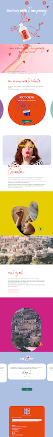
FINAL OUTCOME

Fig 2.10 Final Outcome

Fig 3.1 Original Website Full Page Screenshot
.png)
Fig 3.2 Arrange Artboard & Template

Fig 3.3 Typeface
Content font used : Helvetica Now Display (Medium)


Fig 3.5 Font
Colour used is only black & white except light and earthy tone images. As the website OH Architecture has many images stocks, I utilize it for my web replication. For the composition, I made the same clean and tidy layout.
Left picture - Original
Right picture - Replication
(17).jpg)
Fig 3.6 Images
.png)
Fig 3.7 Details
FINAL OUTCOME

Week 4 on class exercise

REFLECTION
Exeperience
It was my first time replicating a website design. It was not really hard, but time consuming, especially finding the right font to use. Nevertheless, I'm able to complete the task on time.
Observation
What I've observed is that the intention and bussiness is reflected in the design of the website. For example, an architectural website has a neat tidy and clean design.
Finding
Having reference, working side by side with the original website page ease me to do the website replicate. Thorough observation of the website help me to understand the aim and characteristic of the website itself.
.jpg)

Komentar
Posting Komentar