Advanced Typography - Task 1 Exercise
.jpg)
Week 1 - Week 4 (22 /04/25 - 13/05/25)
Felice Jolin (0373636)
Advanced
Typography / Bachelor of Design (Hons) in Creative Media
Task 1 Exercise
: Typographic System & Type & play
TABLE OF CONTENT
Exercise 1 : Typographic System
LECTURES
Lecture 01 : Typographic system
All design are based on structural system. It is important to remember when giving form to a content, communication should be in the forefront. In addition of criteria including hierarchy, order of reading, legibility, and contrast.
There are 8 major variations as below:
1. Axial
2. Radial
3. Dilational
4. Random
5. Grid
6. Modular
7. Transitional
8. Bilateral
This systems is to guide learners in their exploration and over a period of time after developing some maturity then maybe you’ll be able to use more of your intuition.
1. Axial system
-
All elements are organized are to the left/right of an axis.
-
Information is divided into groups and placed in different side/angles of the axis
-
The axial does not necessarily need to be straight
-
Axial system requires only a single line
2. Radial system
-
All elements are extended from a point of focus and is spread out according to that point.
-
All the sentences are pointing to that focus point.
3. Dilatational system
-
A system expand from a central point in a circular manner
-
Can have multiple rings of circle with information on either sides or inline with the circle.
4. Random
-
No specific patten/relationship
-
Eventhough it is random there is a method in the chaos that is created within the page.
5. Grid system
-
A system of vertical and horizontal divisions
-
Information are being structed according to the different grids within that page
6. Transitional system
-
An informal system that is layered banding.
-
Banding means separating information within certain bands.
7. Modular system
-
A series of non-objective elements that are constructed in as strandardised unit.
-
You are able to move it around as long as it fits within a single unit
8. Bilateral system
-
All text is arranged symmetrically in a single axis.
-
Mostly used in invitation/formal invites.

Fig 1.1 Typographical System (Week 1, 22/04/25)
Lecture 02 : Typographic Composition
It is the arrangement of textual information in a given space.
Principle of Design Composition :
1.Emphasis
2.Isolation
3.Repetition
4.Symmetry
&Asymmetry
5.Alignment
6.Perspective
These principles if applied in real-life content (images, textual information and colour) can sometimes feel different. Some may be easily applicabele in imagery but not textual information. Such that emphasis is easily translateable in a typographic composition whereas repetition and perspective perhaps not really easy applied.
.png)
Fig 1.2.1 Emphasis (Week 2, 01/05/25)
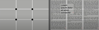
Here is the other rule in composition. This is a photographic guide to as composition. It is a 3x3 grid. The intersecting lines is the guid to place important information.
.png)
Fig 1.2.2 Rule of Thirds (Week 2, 01/05/25)
Typographic System
From the 8 Typographic Systems, Grid System is the most used whicih si derived from the grided compositional structture of Letter Press printing. Now it is known as Swiss (Modernist) style of typography. Although this system might seem old and rigid, it is easy adaptable that's why it remains popular. This is because our approach to reading tends to see something that is in order.
.png)
Fig 1.2.3 Grid System (Week 2, 01/05/25)
Then post-modernist era in Typographical systems introduce randomness and asymmetry however still perform legibility and readability. The exloration is such things like radial, dilatational, random and asymmetrical. Order was replaced with exciting and new chaos.
.png)
Fig 1.2.4 More Exploration (Week 2, 01/05/25)
Other models / systems :
Environemental Grid
Result of exploration of existing structureor numerous structures combined. Could be architetural, painting or any structure. Because this system develop around features of environment associated it could provide context to the forms developed in design.
.png)
Fig 1.2.5 Environmental Grid (Week 2, 01/05/25)
Forms and Movement
It is the exploration of existing grid system. To explore the multitude
of options the grid offers to create something unique. Although still
based on grided structure, result could be something incredibly
different. In addition, it is to eliminate the seriousness surrounding
he application of grid systems and to see the turning pages in a book as
a slowed-down animation.
When there is information occupied in a space with multiple pages of that
space, variation is required and it could create movements.
A static version of a form, placed on a spreads create a hidden message and ensure visual connection.
.png)
Fig 1.2.6 Forms & Movement (Week 2, 01/05/25)
The level of complexity increases when there is additional of colour, elemetns, image, text and so on.
.png)
Fig 1.2.7 Forms & Movement (Week 2, 01/05/25)
Lecture 03 : Context & Creativity
Handwriting
The first mechanically produced letterofrms were design to directly imitate handwriting. It is the unwritten roots mechanical type would try and mimic. The shape and line of hand drawn letterforms are influenced by the tools and materials they are made such as sharpened bones, charcoal sticks, etc.

Fig 1.3.1 Evolution of the latin alphabet (Week 3, 11/05/25)

Fig 1.3.2 Hieroglyphics chart (Week 3, 11/05/25)
Greeks add necessary vowels and developed a phonetic alphabet of 22 letters. The words are in arow but direction of reading si not fixed. You should be able to read from left-right or right-left. They have no serifs.

Fig 1.3.3 Early Greek / 5th C. B.C.E. (Week 3, 11/05/25)

Fig 1.3.4 Roman Unicals (Week 3, 11/05/25)
It has been posssibly influenced by the Egyptian Hieroglyphics and Hieratic Scripts.

Fig 1.3.5 Evolution of Middle East Alphabet (Week 3, 11/05/25)
From oracle bone to seal script to clerical script, traditional and simplified script. Documentation is very important for Chinese.

Fig 1.3.6 Evolution of Chinese Script (Week 3, 11/05/25)

During 450-350 B.C.E , is the earliest writing system developed in India. All modern Indian scripts and hundred scrips found in Southeast Asia and East Asia are derived from Brahmi.

Fig 1.3.8 Brahmi Script (Week 3, 11/05/25)
The word Kawi come sfrom sanskrit word meaning poet. It was a script use to contact with other kingdoms, it was widespread in both Indonesia and the Philippines.

Fig 1.3.9 Kawi Script (Week 3, 11/05/25)

Fig 1.3.10 Traditional Javanese (Week 3, 11/05/25)
More vernacular scripts are produced by software such as google. Multiscrip is a script that combine roman/english letter and vernacular letter.

Fig 1.3.11 Baloo (Week 3, 11/05/25)
Local Movements and Individuals
Programmer and typographer Muthu Nedumaran cracked a programming language needed to encode different types of vernacular writing systems and is now used in mobile phones and desktop.
Young designer should look inward and learn their history, civilization, culture and community to bring these past developments into the future. Creative solution is found by observing your urrroundings and explore the your histories.
INSTRUCTIONS
<iframe src="https://drive.google.com/file/d/11f7j8AC-7IyeFz7rVyGAtKWFraS5cPrA/preview" width="640" height="480" allow="autoplay"></iframe>
EXERCISE 1 : TYPOGRAPHIC SYSTEM
There are 8 typographic system which are Axial, Radial, Dillational, Random, Grid Modular, Transitional, and Bilateral. We were assigned to explore the 8 systems and come out with final 8 typographic posters (200 x 200mm) done in Indesign. In addition to black one other colour can be used also with limited graphical elements.
Chose one headline :
- All Ripped Up: Punk Influences on Design
- The ABCs of Bauhaus Design Theory
- Russian Constructivism and Graphic Design
Content as below :
Open Public Lectures:
June 24, 2021
Lew Pik Svonn,
9AM-10AM
Ezrena Mohd., 10AM-11AM
Suzy Sulaiman, 11AM-12PM
June
25, 2021
Lim Whay Yin, 9AM-10AM
Fahmi Reza, 10AM-11AM
Manish
Acharia, 11AM-12PM
References
First of all, I find inspirations and explore in pinterest.

Fig 2.1 References (Week 1, 22/04/25)
Afterward, I sketches some ideas for each system. These are just the big view of what I will do later in Indesign.

Fig 2.2 Sketches (Week 1, 22/04/25)
At first I tried out the design based on my sketches, however it doesn't feel right after it is on screen. So I decided to modify it from there.
(3).jpg)
I forgot to screenshot however I do take pictures using my phone. Here is my first attempt and some looks far different from my sketches. It turned out to be not as easy as seen, many need to be considered from allignment, kerning, leading and hierarchy. I am not really satisfied with the first design therefore I come up with more variants.
Process
Below is the process of a frew systems.
(2).jpg)
Fig 2.4 Process (Week 1, 22/04/25)
(5).jpg)
(6).jpg)
Fig 2.6 Process (Week 1, 23/04/25)
.jpg)
Fig 2.7 Process (Week 1, 23/04/25)
Fig 2.8 More Explorations (Week 1, 23/04/25)
.jpg)
Below are compiled variants for each systems :

Fig 2.9 Axial (Week 1, 24/04/25)
(9).jpg)
(17).jpg)
(8).jpg)
Fig 2.12 Transitional (Week 1, 24/04/25)
(12).jpg)
(10).jpg)
Fig 2.14 Bilateral (Week 1, 24/04/25)
(7).jpg)
(13).jpg)
Fig 2.16 Randm (Week 1, 24/04/25)
(11).jpg)
Fig 2.17 Transitional revised (Week 2, 29/04/25)
(10).jpg)
Fig 2.18 Bilateral (Week 2, 29/04/25)

Fig 2.19 Bilateral Revised (Week 2, 29/04/25)
(18).jpg)

Fig 3.1 Axial (Week 2, 29/04/25)

Fig 3.2 Radial (Week 2, 29/04/25)


Fig 3.4 Dilatational (Week 2, 29/04/25)

Fig 3.5 Transitional (Week 2, 29/04/25)

Fig 3.6 Bilateral (Week 2, 29/04/25)

Fig 3.7 Modular (Week 2, 29/04/25)

Fig 3.8 Random (Week 2, 29/04/25)
Fig 3.10 Typographic System with Grid PDF (Week 2, 29/04/25)
EXERCISE 2 : TYPE & PLAY
PART 1 / FINDING TYPE
We were assigned to find an image of man-made object or nature or could be structure. Then we were to analyse, identify and disect and extract letterforms (minimum 5). Do refinement in Illustrator and at last make a poster.
Week 2
Chosen Subject

Fig 4.1 Chosen Subject (Week 2, 03/04/25)
Deconstructing Image

Fig 4.2 Deconstruction (Week 2, 03/04/25)
(16).png)
Fig 4.3 Identifying Letterforms (Week 2, 03/04/25)
Exracting Letter form

Identify a Reference Typeface

Fig 4.5 Univers LT Std 49 Light Ultra Condensed as font reference (Week 2, 03/04/25)

Fig 4.7 #2 Refinement letter to the same height (Week 2, 03/04/25)

Fig 4.8 Notice consistent characteristics for refinement (Week 2, 03/04/25)


Fig 4.7 #5 Refining letter k (Week 2, 03/04/25)

Fig 4.7 #6 Refining (Week 2, 03/04/25)


Fig 4.10 Comparison with original letterform (Week 3, 06/04/25)

Fig 4.11 Final Type Design (Week 3, 06/04/25)
(18).jpg)
Next, I chose relevant image for the poster.


Fig 4.15 Reflection (Week 3, 06/04/25)
.png)
(19).jpg)
Fig 4.17 Variatios(Week 3, 06/04/25)
.png)

Fig 4.19 Poster design, JPG (Week 3, 06/04/25)
Fig 4.20 Poster design, PDF (Week 4, 13/04/25)
Fig 4.26 Comparison with original letterform (Week 3, 06/04/25)
Fig 4.27 Final Type Design (Week 3, 06/04/25)
Fig 4.28 PDF Compilation (Week 3, 06/04/25)
Fig 4.29 Poster design, JPG (Week 3, 06/04/25)
Fig 4.30 Poster design, PDF (Week 4, 13/04/25)
FEEDBACK
Week 1
General Feedbacks : Brief about what should be done during
week 1.
Specific Feedbacks : If there are multiple images, compile it into one image.
Remember to write figure number, information, week and date below
picture. Compile the 8 design into one jpeg.
Week 2
General Feedback
:
Mr.Vinod gave one by one feedback for us.
Specific Feedback :
Mr. Vinod mention that my transitional design could be from
left-right-middle, instead of just left-right for aesthetic purpose.
Also for my bilateral design, it was actually multilateral because it
has two axis. Graphics is for additional, the important aspect is the
text, how it is appealing even when there is no graphics.
Week 3
General Feedback
:
Mr.Vinod gave us feedback on exercise 2
Specific Feedback :
Mr.Vinod like my letter F and H, letter A need a small change for the
middle hole, make it larger. While for letter K and R need more
improvements. Mr.Vinod said, I can use the style in letter F and H for
the rest of the letterforms. In addition, I can have thin stroke but
makesure it is consistent. Lastly, Mr.Vinod suggested me to make the
letter R stroke from thin to thick as it reflects branch
characteristic.
Week 4
General Feedback:
Feedbacks for Task 2 Exercise 2 poster.
Specific Feedback:
The attemtp is to place the text within the context of a larger image.
With the background and text it adds to the overall poster. Overall
poster is good, pretty minimum but nice.
REFLEC TION
Experience : It was just the first week of the semester but we are already overwhelmed by many works. However, I realize that I spent most time at this module, starting from the sketches to digitizing, it is really a long process. In a blink of an eye it is the end of week 3, days and nights were spend with efford for this module. The workload of week 1-2 were quite a sum with a limited time but good thing that I could manage my time well and finish it on time and I am quite satisfied with the results.
Observations : I often do my task together with my friends. During the process of making, we asked each other's opinion. By that I think we gradually develop and could see things from different perspectie and overcome different styles.I have come to see that a single system could be interpret in various ways on different hands. I also observe that using a good amount effective use of white space could enhance the visual.
Findings : In this very limited time, I quite used to Indesign. This task has developed my skills of understanding and applying the typographical systems. I have also come to realize that what we actualy imagine may not look good on screen, therefore trials need to be done to see the visual develop it. Lastly, not just paying attention to my own feedback, the feedback Mr.Vinod gave to the other peers are also become an encouragement for me reflect back on my works.
FURTHER READINGS
Week 1
.png)
Fig 5.1 Typographic Systems by Kimberly Elam, Week 1 (24/04/25)
.png)
Fig 5.2 Typographic Systems by Kimberly Elam, Week 1 (24/04/25)
When several lines are too long, need to break them and make it into appropriate pattern, grouping is important as it simplifies and enhance readability.
.png)
Fig 5.3 Typographic Systems by Kimberly Elam, Week 1 (24/04/25)
.png)
Fig 5.4 Typographic Systems by Kimberly Elam, Week 1 (24/04/25)
Using non-objective elements make things clearer. It could enhance organization, balance and emphasis. It is a functional guide as it clearly communicate the message in with a sense of hierarchy. The typography blends with the message, turning it into a visual composition.
Week 2
Finding Type: A Novel Typographic Exercise by Vinod Nair
Source :
Kreatif Beats
Mr.Vinod said that custom typefaces in animation, movie and game design are rising in demand. The branding of movies has now focus on the customized letterform and in this content creation era, typefaces is a very crucial aspect. Therefore, Mr.Vinod design a task that allow students to customize letterform. The steps are broken down into below :
1. Finding an image.
2.Deconstructing an image.
3.
Identifying letterforms.
4. Extracting letterforms.
5.
Identify a reference.
6. Refining letterforms : Introduce
consistency in height, width and contrast. Deliberate on retaining or
removing characteristics. Decide what areas require
simplification.
(17).png)

.png)
Komentar
Posting Komentar